Monday 23 May 2011

Planning For Assignment 4.

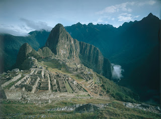
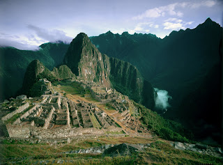
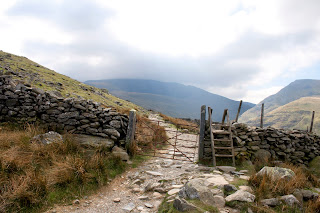
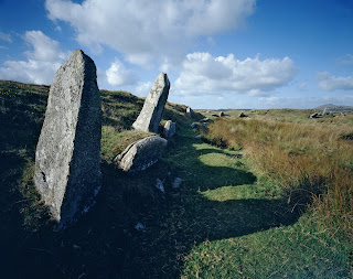
For this assignment I'm asked to produce 8 landscape photographs which all address, in different ways, a common theme.(The suggested themes begin water, earth, fire, air) Clearly here I'm given alot of scope to be able as creative as i can be, my first thought was keep things simple and just shot a range of images following one of these theme and then use some of the methods I'd studied in the last section say to alter the light conditions or change the feel of the weather. The problem being that i can't say i feel overly inspired by this idea, but then the other day i read an article that gave me a much better idea.

Below are some examples of images produced by a photographer call Abelardo Morell (photos taken from his website http://www.abelardomorell.net/).


He produces these images in a mix of old fashion camera obscura technique and digital photography, what he does is first is turn a room completely dark by covering all the windows except for a small whole which the light from outside travels through and projects the image onto the opposite wall (it originally appears upside down but by using a prism he corrects this) then he captures the effect using a modern camera. Basically its alot like the way our own eyes capture images, what makes his work so interesting is the combination of the rooms and views that he finds and combines. Lets take the final example where the outside garden has be projected onto the wall, here its like you have to look twice to decide which parts are in the room and which are in the garden because the house plants blend so well into the theme. I also like the way the texture of the walls adds another dimension to an already clever concept.

What I'm thinking of doing for this assignment is something along the same idea but using photoshop to place landscapes onto the walls of room, i want it to feel like I've brought the outside into the room but i still want it to feel natural so maybe there should be some association between the two scenes. I'll have to think more on this but i thinks there's a good starting idea here.

Friday 20 May 2011

Project 25: Blending Body Parts.

This was a project that I'd been looking forward to tackling because it's an area that I've attempted to play around with before but never had much success with so here goes.
Basically what I'm looking at here is creating some Surrealist images, what these are are images that are believable to look at but you know that there impossible in the really world. This kind of imagery has been around alot longer then photography but with modern photography software we're capable of producing some very original photos that in the past you might have only seen in paintings.
What I'm asked to do to begin with is take the hand image on the left and the tool on the right and combined them into one believable image. This is where I'd run into problems before because i could never get the blending quiet right but with the explanation here things went much better. The first job was to open the hand image ,then the tool shot and in this using the selection brush pick out the tool from the background. Next after pasting the tool over the second finger a little re-scaling was need just to fit the two parts together and then the harder work began, first i need to erase the handle of the scissor tool because with it spreading across the fingers it spoils the effect some what. With this done i set the eraser opacity to 20% and began to erase around the base of the tool so as to begin to blend the tool and finger seemingly together. Finally i flattened the layers as i was happy with the result which you can now see below.

I have to say this is by far the best blend I've ever done, i never really played around with the opacity before this course but now can understand the creativity that it give you because of the control over how much of the image below you let through at any time. Where i also have run into problems in the past has been with the consistency of the light when producing work like this, what i mean is that I'd shot one image and then in the next the light wouldn't appear the same and as much as I'd try I'd never seem to get it right but in the next part of the project I'd have to because what I'm next as to do is produce my own Surrealist image.
What i decided i wanted to do was combine a very natural image with something a little less natural so first i captured a few plant images and some wildlife shots of birds and insects. In the end i selected the above shot because i thought I'd be able to alter the petals and centre area in some way.
Next i had to find my unnatural image to add to it, above is the photo i took which I'd use for the central mass of the flower but i also tried to find metallic surfaces that i could then blend into the petals. This i found didn't work very well and i felt i was over complicating the subject a little so in the end i only work on the centre of the flower. It still ended up as a pretty good image as you can see below because it really looks as if the glass marble is part of the plant.
I used the red and yellow marble because of how the reds compliments the yellow so well and keeps the theme of warm colours which using the blue ones would have broke up. I feel that i handled my lighting problems pretty well but I'm still not that happy with this part of the process. This project is defiantly one i plan to come back to and have another crack at because i still feel that i can do something with the petals i just have to find the right image.

Sunday 15 May 2011

Project 24: Extreme Distortion.

This is one of them projects when you first look at it you think god that's going to be complicated but actually its not as bad as it seems. For this project your asked to look at extreme distortion and the effects that can be produced when using the Liquify tool.


To begin with you're given the two photos above to work with and asked to create a image where the measuring tape appears to be wrapped very tightly around the apple resulting in it looking as if its being squeezed. To do this the first step is to make the apple look squeezed, to do this i used the Liquify tool in the filtered menu, when selected i made the brush size around half the size of the apple then click first on the left hand side of the apple and dragged inwards and then repeated the process on the right hand side. Next i copied and pasted the measuring tape into the apple image and scaled it down to fit around the distorted area I'd just created, from here its beginning to look like the finished product but one little alteration i still wanted to make was to use the warp tool i have in my version of photoshop to make the fit even more realistic.


Above is the final version of my image, compared to the version on the course disc i haven't squeezed the apple anywhere near as much because i think it appear overly distorted if you push it as far as they have. If you look below I've produced my pepper image in a similar way to the apple one but this time I've gone to far more of an extreme approach. To me these kind of images work much better with the idea of less equals more, the less distortion added the better they look.


For the final part of this project you're asked to produce you're own conceptual image in which shape changing will make a point, so for this i came up with the idea of using the symbol of money and a belt to reflect the state of the economy and how everyone is having to so called tighten there metaphorical belts. Above is the photo of some money i used and below is the belt image i took for the other half of my final shot. I did have some problems matching the lighting of the two images but i feel i resolved this problem in the end through use of the flash. This is an area I've always struggled in and hope with further practice to resolve or at least get a better handle on.


The final image below was produced following the same process as in the first part of the project, what i like about it is the good contrast between the purple of the notes and the green of the belt they help to make it a good piece. The only criticism i do have on it is that at the time when i produced the image i was very happy with the amount of distortion I'd used but now when i look at it i feel maybe i over did it and that should i come back to this project a little reduction in the liquifying process would make it look better. Yet again maybe I'm being a bit over critical of my own work but i do find that if i look to long or to often at anything i take i slow start to dislike it and can always find things that I'd alter, but when I've fix that problem I'll find something else. I think all photographers go through a stage of hating there own work its just one of them things I'll have to work through.


Saturday 14 May 2011

Project 23: Facial Distortion.

As i move into looking at Distortion Tools and techniques the first project looks at easily the most widely know and most seen area of photography where these kind of techniques are used Portrait Photography. We're all use these days to seeing photos of celebrities where they've had a little work done digitally so most people have a little understanding of some of the methods used such as air brushing and now there are even dedicated pieces of software that are dedicated to this process. What I'm about to look at here is only a very basic couple of distortion tools but as ever they can drastically alter the appearance of an image.


Original Wide Angled Image.


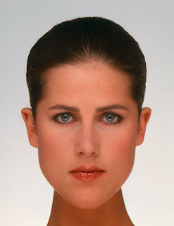
Above is the first image I'm given to work on and as the title says its been taken with a wide angled lens which in its self has had an effect on how the subject appears. What the wide angle does is exaggerate in size anything that is nearer the camera so most professional photographs would opt for a medium telephoto lens to combat this problem. If you don't have this available to you there are ways to fix the distortion produced by the wide angle lens and that's what my next set of photos looks at.


Pinch Filter Extreme Distortion 1.


Punch Filter Extreme Distortion 2.


Pinch Filter At 10%.


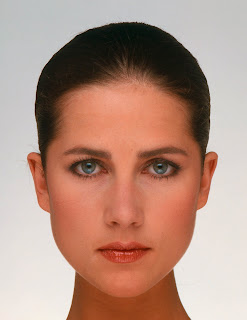
The first two photos above show the kind of extreme that can be created when using a Pinch Filter. What a Pinch Filter actually does is reverse the wide angle lens effect when the slider is moved into the positive by pulling the centre of the image inwards (2), and when moved into the negative it has the opposite effect (1). What soon becomes clear when playing around with this filter is that it's only very small amounts of positive movement needed to correct the distortion so in the final image above where I've added only 10% you can see that the face appears much more in proportion so that the eyes and nose don't appear larger then they actually were.


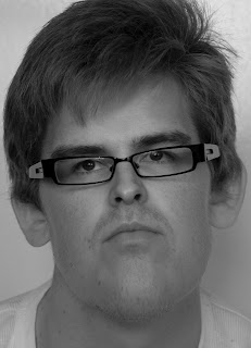
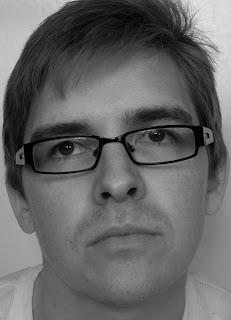
For the next stage of this project I'm asked to use a portrait of my own and experiment with the Pinch and Spherize filters so as to gain more experience with how they effect the proportions of the face, the image I'm using above already to me looks strange in that the head and feature look over blown so now I'm going to look at how the filters effect it and if they improve it.


Pinch 25%.


Pinch 50%.


What the pinch filter does is to reduce the size of the features such as the eyes and nose but doesn't appear to alter the head size. What I've ended up with is something that almost creates a cartoon stile effect of the subject, especially in the final image.


Spherize 20%.


Spherize -10%.


When the Spherize filter is used in a positive manner it only increase the distortion making things appear even larger then ever, but what i did find was that when used in the negative at only 10% it reduced the distortion to the point that it appeared the natural and improves the overall look of the person.


In today's world in which how you look is very important for many reasons you can understand why these kind of tools are an important part of a portrait photographers arsenal and understanding the distortions that some lens create is very important. I guess people weren't lying when they said the camera can add 10 pounds.

Tuesday 10 May 2011

Project 22: An Improvement In The Weather.

The next project continues along similar lines as the last but this time its more about improving the apearance of the weather in the image rather than making it seem worse.


Here we have a shot that has been taken with the light not quiet at its best resulting in the colours appearing very dull and the overall shot being a little bit of a let down, so how can this be fixed in photoshop? Well suprisingly again its a fair simple process which unfortunatley is made more difficult by the fact that some of the files that are supposed to help you are missing from the course disc (i look everywhere and couldn't locate them, maybe it's just my disc). It tells you they you should find the pre-selected areas presumable made up of the foreground, mountains in the background and the sky on the disc but there just not there so using the selection brush i made them myself. The first area to work on is the foreground, to begin with i used the Levels tool closing up the white and black points to produce a better contrast in this area. Next to give the colours the appearance of more stronger sunlight i used the Hue/Saturation tool using the setting given in the course folder (them being Hue -15 and Saturation +30), this does produce one problem which is the red path becomes very dominat so to fix this i then select Reds from the drop down menu and moved the Hue slider to -10 making it fit more closely with the rest of the colours. With this area finish its time to move on to the sky again i begin by using the Levels tool this time i close up the white point but only alter the black point very slightly because i don't want any pure dark areas in the sky as i'm trying to make the light appear brighter and stronger. Following this i moved to the Hue/Saturation tool but this time i'm only interested in the Cyans colour so selecting this from the drop down menu i can remove this particular colour cast by moving the slider to +15. The final alteration you're told to make is to the mountains in the background as the author whats them much darker to make the city on the hill top really jump out and hit you between the eyes, for this it tells you to use Enhance>Adjust Colour>Replace Colour but i found a better way for me to get the right effect was to just darken it using Brightness/Contrast as it provides the same effect in my eyes. So below you'll find the finished image is it an improvement well yes because it now appears to have been take on a much brighter day because the colours look strong and there's much more contrast and detail visible then in the original. Now the question is can a repeat the process in one of my own images?


For this part of the project i have chosen the above image because it has some of the same problems as the course image in that the light being quiet dull has meant that a lot of the colour and detail has been lost from the foreground so hopefully following the same process i should now have the skills to fix it. Below is the results of my processing, to achieve this look i first selected the foreground and only used the Hue/Saturation tool to bring back the colours that had been lost, what i didn't do was go anywhere near the sky or the background, you may argue that sky could have done with the brightest areas being dulled but i like the way this looks and now with the colours more in keeping with this brightness it makes the whole shot feel right.


I could have gone for a more challenging image to alter but i felt after the previous project and with the work I'd done in this i have a pretty good grasp on how to alter the appearance of the weather and light in my landscape imagery, as i said in the last project I've taken more from this because of how it relates to my personal interest but i still agree with my original thought that i would only use this as a last resort if i wasn't able to capture the conditions i was after, with the weather in this country begin as unpredictable as ever though it might end up being more often then I'd like.

Sunday 8 May 2011

Project 21: A Stormy Sky.

To begin this section you're given a very straight forward and simple project to complete centered around the idea of begin able to alter the appearance of the weather conditions within a photo.


You're given the above photo to work on (which isn't a bad photo to start with) and told to first using the magic wand or the selection brush select the sky, next i need to remove the colour from this area so using Enhance>Adjust Colour>Remove Colour to do this then Enhance>Adjust Brightness/Contrast>Brightness/Contrast to weaken or darken the sky to the point where i was happy with the appearance. The results that i achieved following this process were no where near as good as I'd expected them to be if I'm honest so reverting back to the original shot i attempted my own approach. What i did differently was with the sky selected i went to the Hue/Saturation controls and removed as much of the colour from the sky as i felt was necessary and then used the Brightness/Contrast to pick out areas to strength that had become a little lost or faded in the process. After i was happy with the results it was then time to move onto the foreground, the reason this needs some attention is that now I've played around with the sky it just doesn't appear realistic anymore, the effect I'm aiming for is a look similar to when you have the sun out reflecting off the dark clouds (which makes these appear darker and more imposing) but also makes all the colours seem much brighter too. To do this i first inversed my selection and then again using the Hue/Saturation tool only slightly increased the saturation because i did want the effect to appear to cartoon like in appearance. One added process i did find i had to add was a warm filter because the foreground appeared to have a very strong blue hue to it making it very cold, so by adding a orange filter i was able to remove this to a point and give it more of a neutral feel. Below you can see the final results.


I found this one of the more enjoyable projects because the focus is more on the area of Photography that most interest me, I'm not saying the others haven't been good its just that these kinds of projects i tend to take much more away from. I'd never overly considered adjusting the weather conditions before in my work but i can see how this can be a useful tool because all photographers know sometimes you can't rely on the weather to produce the conditions you're after so having a back up solution is never a bad thing but i still rather only use this process as that.


Wednesday 4 May 2011

George Logan.


The best word to describe Logan's work would probably be surreal and in some parts i suppose a little comic. If you take the examples above for example you have a very pregnant statue on Easter Island, clearly not real but it does have a comical air about it. Next you have the plug hole in the road image which is much more believable than the other two but it is a little bit of a mystery to myself as to what he's trying to get across with this idea, could it be to do with the amount of water we waste? Hell i don't know i think I'm clutching at straws with this one. Finally I've used one of my favorite images of his where he's made it appear as if the lorry is trapped in the passing bubble, is it a piece of very good timing or has the bubble been add in post production? This is part of the appeal but the other would be the idea maybe behind it in that when you look at the surrounding landscape it appears green and clean but the one thing that can damage this environment is trapped away in its own little bubble.


Gregory Crewdson.


Gregory Crewdson work is produced in a completely different manner to the other peoples that I've look at so far, where as they use alot of photoshop to produce theirs he does use some but his is more staged. He positions his subjects and then using lighting create these almost dream like images, some softening and colour alteration is add using photoshop but that's about as far as he goes. Clearly there's a different skill set needed to create these kind of shots but no less imagination then anyone else I've look at. As I've said its the dream like appearance of his work that makes it so eye catching but also his use of colours to build and reinforce the moods that he's creating. Out of the three examples of his work here my favorite has to be the middle shot with the child looking up into the light, it feels quiet mystical in away and really draws you in.

Tuesday 3 May 2011

Jon Compson.


A lot of Compsons work is based in the world of fashion but one or two pieces i found quiet interesting and felt need a little more study. The three photos above all taken from his site http://www.joncompson.com/ have something in common in that they take something that is familiar to us and distort it in a way that you don't lose the familiarity of the scene but create something completely different. For example with the last shot of the Eiffel Tower he's taken a typical shot of the lower half of the tower and then some close up view of the steel work and combined them all into a single images. As I've said its good because you can look at it and understand what the subject matter is without spending to much time considering it. Another reason why these images work well is the simplicity of them, he doesn't try to over complicate the scenes while giving them a very natural feel.


Sunday 1 May 2011

Joan Charmont.


The first two images here are probably some of her better work the rest like the last one are a little bit strange and if I'm honest some of her stuff is frankly a little scary. She says she gets a lot of inspiration from sci fi short stories and novel's, when you look at her work as a whole (http://www.joancharmant.com/index.php) you can kind of see this because with some of it there's a very futuristic feel about it. On the other hand some of her images are a little off the wall and i wouldn't class as being a photo at all anymore even if they did start life in this way. Don't get me wrong there is merits to what she's doing and i really like the first image I've taken from her site but it's just i don't think her stile of work would fit into the essay i want to right, hers is more in keeping with the final theme. Its still helpful to look at the wide range of images people are creating these days because it shows how much more accepted these kind of images are now.


Erik Johansson.


His work is highly creative and appears to bend our idea of reality but yet his images appear very realistic. Not an easy balance to achieve but he does some how pull it off. Of the three examples i have here my favorite is the middle image where the woman appears to be painting in the sea but actually if you look closely you see she's actually painting a floor to a point but the blending of the images is that good that you'd hardly guess it wasn't a real shot. He says he gets his inspiration from what he sees around him in his daily life and his photography is his way to express the ideas he has in his mind, in that case he's either brilliant or completely insane because some of his work (which can be found at http://alltelleringet.com/ ) is really strange like one shot I've seen where he's got the ironing board out and is actually ironing himself! Its the kind of work that you look at and have to wonder how he did that, that's part of the appeal i think its the need to understand how these effects are created.

How his work relates to my essay I'd say is because his use of digital manipulation is about the limit of what I'd say is acceptable before it becomes something more then just photography, you may agree or you might say that its too much but what you can't argue against is that his work stands out in the field of modern digital photography.