- Create a duplicate layer of the object you wish to add a shadow to
- Take this dupicate layer and in this case highlight the clock face and using the fill tool fill it with black.
- With the duplicate layer still selected make sure it is under the original layer and select Edit>Transform>Distort and drag the top corners slightly to the right or left depending on which way you want the light to appear it is coming from.
- Next use Filter>Blur>Gaussian Blur on the duplicate layer and set it to about 11 pixels this give the effect of diffusing the layer and making it appear as if its further away from the original then it actually is thus creating depth.
- Finally to make the shadow seem a little less strong reduce the opacity of the layer by around 50% and then flatten the two layers together.
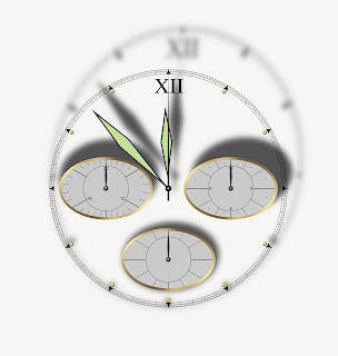
 If you follow the above process you end up with an image which looks a little like the one above, i have to say this was a lot easier then i ever imagined it would be for some reason i thought it would take days to create something as realistic as this and then i never would have guessed it would look anything like this. Even at this point when I'm nearly half way through the course I'm still surprised by what you can actually do with layer and modern photo software if you know what you're doing, I'm beginning to think that with the right tools anything is possible in modern photograph.

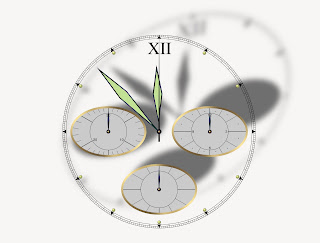
 Just to finish off this section i had a little more of a play around to make sure i fully understood the process. In the two above images i used different amounts of distortion and blur to increase the feeling of depth/distance just to see what the limits of the process actually are. With the second image i feel that i maybe went a little to far because the distortion appears too strong and at a bit of a strange angle that you would imagine possible but with the first one I'm quiet happy with how it seems that the light is being held very close at a low angle stretching the shadow but keeping very dark.
No comments:
Post a Comment