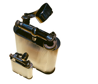
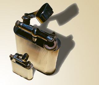
 Using the same process that I'd already perfected with the clock faces i first added the shadow and then the gradient to give the impression of a light source. You can see the results of this below.
Next i had a go at also adding a shadow to the smaller object, i know in the course it tells you not to do this but i felt good about how my work in this section was progressing so i decided to have a crack and see how things turned out. Above are the results and again I'm fairly happy, the smaller shadow does appear a little too dark but other then this i didn't find it that hard a process to add this second shadow to the final image.

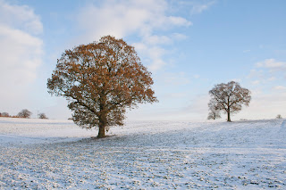
For the final final part of this project you're asked to shot an object yourself, separate it from its background and give it a shadow. Now i haven't really followed this project to the letter instead i wanted to see if i could add a shadow to a landscape shot of my own. The above colour image of the two trees is the original and as you can see the black and white one is my final version, to create this i first had to increase the image size so i could fit the shadows in where i wanted them, then it was just a matter of using the clone stamp to fill this new area and then again following the same process as before to add the shadows. The reason i produced my final image in black and white is because i feel it works much better to focus the viewer on the shape of the trees and the shadows they appear to be casting.
Although i still feel that i need more practise to refine the process of adding shadows i think by finishing this project in the way that i have it shows that i understand it well enough to use it in any number of future situations.


No comments:
Post a Comment