When you compare my version of the image to the final shot in the course material you see that I've taken a slightly different approach. In the course material more of the fields surrounding the mound were lightened but i think it looks better when literally just the hill is lit making it standout more from the surrounding countryside. You may not agree of course but that's the whole point that you don't always have to copy what you're shown, i like to experiment and find what i like and feel works best but this can be different for everyone.
 Sunny Day.
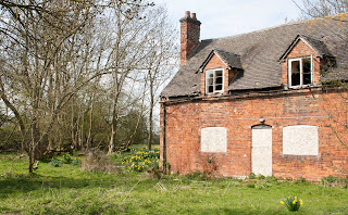
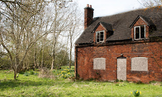
For the final part of this project you're asked to produce your own image using this process, what i chose to use here was a view of an empty house near to where i live. What drew me to this scene originally was the contrast in it between this crumbling house and the signs of spring appearing around it. In the sunny version it feel quiet nice and pleasant like a spring day tends to feel but then when you look at the duller day version there's something a little creepy about the empty windows and the boarded up lower level. What I've tried to do is combine these two different feelings into one shot that you can see below.
 Final Version.
Begin critical about this I'd have to say that i don't think it works as well as I'd hoped it would and if I'm honest i think it looks a little bit to unrealistic like someone has almost placed a house into a scene.
On reflection i don't know that i like this way of producing images that much, don't get me wrong it can be a useful tool if used in small amounts and you can get it to feel more realistic but on a larger scale that I've gone for above I'm just not sure it works as well. Maybe its just that i need more practice to get this effect right and to understand how best it can be used in my own work.
On reflection i don't know that i like this way of producing images that much, don't get me wrong it can be a useful tool if used in small amounts and you can get it to feel more realistic but on a larger scale that I've gone for above I'm just not sure it works as well. Maybe its just that i need more practice to get this effect right and to understand how best it can be used in my own work.


No comments:
Post a Comment