Monday 28 February 2011

Project 13: Selecting An Object.

For this project i was asked to look at how to use the Magic Wand Tool to select and outline an object from its background. For the first part i'm given the image below to pratice on so as to get the hang of using the tool and setting the tolerance so that the object is the only thing highligthed.

Original.
To begin with i was doing this project completely wrong for some reason i kept clicking on the object and trying to get the whole thing captured so that i could then inverse the selection so it was just the background that was select (why i was doing this god only knows), then i released why don't i just click on the background in in the first place as its one solid colour meaning it'd be much easier to set the tolerance to capture this. How stupid do you think i felt when this took about two seconds when i set the tolerance to 50 and clicked on the background and there you have it the perfect selection. Next job was to feather the edges so they don't appear to hard and unrealistic when the object is lifted from the background. To do this i went to select>modify>feather and set it to 1 pixel. Finally when i was happy with the way things were looking i fill the background with white using edit>fill and below are the final results.


My Image.
For the second part of the project as usual now i was asked to follow the same process with one of my own images, below is the image of a flower i chose. The reason i went for this particular shot was because i wanted something with a slightly more complicated outline but something that would be relatively easy to separate from the background.

My Original.
I did find it a little more difficult getting the tolerance right as i kept catching the darker areas on the leaves every time i selected the background but once I'd got over this problem i found the process relatively easy to complete although because i was taking it from a dark background i did keep ending up with a kind of dark halo around the edges until i got my feathering right when set to 5 pixels. Below is my final image.


Final Shot.
Overall another technically challenging project that i know will come in very useful when i get to my second assignment. I like the way this part of the course is slowly building up your skill set in this area, many of the functions in photoshop you tend to avoid or just take no notice of but actually knowing and understanding there uses can only add to my creativity in the future.


Saturday 26 February 2011

Photomatix.

In project 11 it mentions a piece of software call Photomatix which i have had and been playing around with for a little while now. You use Photomatix to produce HDR image (high dynamic range), this is basically when you take three or more shot of the same scene capturing the full range of shadows and highlights by over and under exposing the images. Then the software takes your images and then combines them to produce a single image, of course it offers you sliders to be able to fine tune the results to your liking but this means it can become a time consuming process and you might never get it just right.


Above are a few examples of the sort of stuff that I've managed to produce using it (all above are just three frames combined), what I've discovered is that its best used under overcast conditions when you don't feel you can capture the true colours you're after and its also quiet useful if there's a lot of heavy shadow in the scene. One draw back i find with this process is that your images tend if you're not careful when playing with the colours to have a very orange or pink colour cast to them but this can be avoided if keep the saturation turned down. Overall its something that i enjoyed using and plan to play with some more in the future to discover its limitations.


Project 12: Changing Light.

In Project 12 I'm continuing to look at the ideas set out in Project 11 but this time you asked to take it a stage further while keeping the photos as realistic as possible. What you asked to look at is how to photos taken at of the same location but under different lighting conditions can be combined to make one image. The example I'm asked to look at is two shots taken of Cadbury Castle (one on a sunny day the other on a far more cloud day) which i then need to combine using layers to make it appear that the sun is just illuminating the hill. To create the effect i used the same process as in Project 11 which was to copy and paste the darker image over the lighter image into a new layer and then to use a soft edge eraser to remove the area over the castle mound creating the final image you see below.

My version of Cadbury Castle.
When you compare my version of the image to the final shot in the course material you see that I've taken a slightly different approach. In the course material more of the fields surrounding the mound were lightened but i think it looks better when literally just the hill is lit making it standout more from the surrounding countryside. You may not agree of course but that's the whole point that you don't always have to copy what you're shown, i like to experiment and find what i like and feel works best but this can be different for everyone.

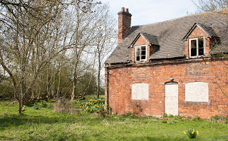
Dull Day.


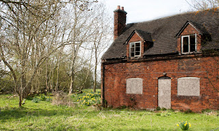
Sunny Day.


For the final part of this project you're asked to produce your own image using this process, what i chose to use here was a view of an empty house near to where i live. What drew me to this scene originally was the contrast in it between this crumbling house and the signs of spring appearing around it. In the sunny version it feel quiet nice and pleasant like a spring day tends to feel but then when you look at the duller day version there's something a little creepy about the empty windows and the boarded up lower level. What I've tried to do is combine these two different feelings into one shot that you can see below.


Final Version.

Begin critical about this I'd have to say that i don't think it works as well as I'd hoped it would and if I'm honest i think it looks a little bit to unrealistic like someone has almost placed a house into a scene.
On reflection i don't know that i like this way of producing images that much, don't get me wrong it can be a useful tool if used in small amounts and you can get it to feel more realistic but on a larger scale that I've gone for above I'm just not sure it works as well. Maybe its just that i need more practice to get this effect right and to understand how best it can be used in my own work.


Wednesday 23 February 2011

Janne Parviainen.

I saw some photos by him the other day in the The Sun newspaper and thought how different and unique they were. What he does is to set his camera for long exposure and then using lights paint objects and people into the scene, its very clever and when you study his work it must be really hard to master and get right. My personal favorites have to be the ones where he's painted people into the scenes in almost a skeletal form such as Midnight souls still remain and Late night show, then there's his light graffiti work which is equally interesting. Defiantly aim to have a go at painting with light just love the effects produced.

See his work at-
http://www.wix.com/jannepaint/jannepaint
and at
http://www.flickr.com/photos/jannepaint

Monday 21 February 2011

Project 11: High Density Range.

In this project you're asked to look at how to resolve the problem if the your attempting to photograph a subject and your camera isn't capable of capturing in a single image the shadows and highlights as you feel they should appear. To get round this problem there is a very simple fix but it can be a little time consuming but the end results are worth the effort.
Light Version.


Dark Version.

To begin with you're given the two above images and asked to combine them to create a single image which captures the shadows and highlights. What i did to produce this was first to open the light version then next open the dark version and select the whole photo and then copy it. Next i pasted the dark copy over the light version so i now had two layers with the light version begin the background layer and the dark version sitting on top in a different layer. What this meant was that i could know take the rubber tool and erase specific areas to gain the effect i wanted, in this case i was going to remove the reflection underneath the shell so that the reflection in the lighter version would show through. While doing this i did try altering the opacity of the rubber (this either strengthens or weakens the way the rubber works) and found that i was most happy with the results when i had it set at 54%. Finally when i was happy with the results i flatten the image to combine the two layers and the end results are shown below.

Combined Version.

The only problem i found while doing this part of the project was working round the edges of the reflection because if you weren't careful you could easily have the background in the light version bleeding through as well. What i found work best was to use a soft edged rubber because then at least if this did happen then it wasn't as obvious as it could be using a hard edge one.


Dark Version.


Light Version.

For the next part of the project you were asked to take two shots of your own of the same scene, one had to be exposed to capture the highlights the other to capture the shadows. The first point to make about this is don't try doing this without a tripod because your photos when layered together just will not line up properly. The best way i found to set up my camera for this process was to go into the menu and select the AEB mode and tell the camera to take a set of three shots one at the middle setting then one at -1 and the other at +1 meaning you end up with the shots you need (this may not be the best way but it work well for me). Above are the tow images i selected and then below is the final version i produced following the same process as with the first set of photos.

Combined Version.

I'm very happy with how this photo turned out and with the process I've learnt as a whole because i know how difficult it can be in certain light conditions to capture the shot as true to the eye as I'd like so its good to have an alternative to fall back on, plus if my camera isn't capable because of its dynamic range then again it comes in useful.

Saturday 19 February 2011

Project 10: Blending Modes.

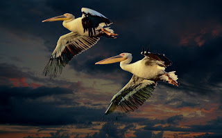
In this project you're asked to look at using Blending Modes to combine two different shots to create a single new image. The first thing that i did was open the image of the two pelicans because before i could do anything else i needed to seperate and copy the birds from the rest of the photo. The way i did this was to first to use the Magic Wand tool and select the blue background around the birds then i went to SELECT>INVERSE which has the effect of reversing your selection so now instead of just having the background highlighted i now have just the birds. The problem with this process is that when you copy areas like this they tend to look very angular and un-natural so to solve this i used SELECT>MODIFY>FEATHER and set it to one pixel, what this does is contract the selected area and soften all the edges making it appear more normal. Finally all i needed to do was copy the area i now had highlighted and then paste it onto the second image provided in the course material of a sky at sunset or sunrise and i had my two layers to work with in the blending modes. Below are the images i created.
Normal.

Dissolve.


Darken.

Multiply.

Colour Burn.

Linear Burn.

Lighten.


Screen.

Colour Dodge.

Linear Dodge.

Overlay.

Soft Light.

Hard Light.

Vivid Light.

Linear Light.

Pin Light.

Difference.

Exclusion.

Hue.

Saturation.

Colour.

Luminosity.
By going through this process i have to agree with what is said in the course that alot of these aren't that suitable for photography but the one that I'd most lightly use in my own work would be normal, multiply, screen, hard light,difference and luminosity because these produce the best effects in my opinion.
I did have one problem with this project in that i could get the modes to work on the top layer containing the birds but to begin with i could get the same results on the background layer. After consulting my tutor i soon resolved this problem because he explained that i should have duplicated the background layer so i could add the blending mode to it, quite straight forward in the end but you have to ask why this process wasn't explain more clearly in the course material? I know it's a level 2 course and by now i should have a reasonable understanding of the software but sometimes i do feel the author takes certain things for granted which he may have covered in other course which i haven't done, maybe it's just me but that's how i feel.

Tuesday 15 February 2011

Project 9: Resizing.

Project 9 is designed to help you understand how different forms of interpolation affect your work when resizing it and which are best to use. Below is a image i took of a heron fishing, if i wanted to make this shot larger for printing there are 3 main kinds of interpolation that i can use:-
  1. BICUBIC
  2. BILINEAR
  3. NEAREST NEIGHBOUR

Original.

To see how these work and what effect they have you're asked to create 3 copies of you chosen image and then enlarge the image by 150% using each of the rework tools mentioned above, below are the result. What I've done is selected an area where the results are clearest when zoom in to 100% so that there easier to compare.


Bicubic.


Bilinear.


Nearest Neighbour.


The Bicubic image appears the best if a little over sharpened in places especially around the bottom where the beak meets the head and around the eye. In contrast the Bilinear image appears much softer when compared to the bicubic and almost feels like some of the detail has been lost in the enlargement process. Finally the Nearest Neighbour image appears the worst as the pixels appear much larger and obvious meaning that there's a clear loss of quality.
If i was to chose one to use when enlarging or reducing I'd got for either bicubic or bilinear because these seem to retain much more of the detail then nearest neighbour, i found that in my version of photoshop this process can be taken one step further because their are know specific version of bicubic for enlarging or reducing which make it a much more easier chose. Its wasn't something that i'd ever used before so i found the project both enlightening and useful for future reference next time i have my work printed.

Monday 14 February 2011

Edward Burtynsky.

I discover his work while reading an article about his career so far and found that i liked the ideas he's trying to get across to the viewer. What he focuses on is using large scale images to show how human activity is shaping our landscapes through heavy industry such as mining operations,refuse sites and factories. Its the environmental side of his work that i think most attracted me because i share the view that the more people are made aware of the damage we are doing to the environment the more we'll strive to fix the problems we're creating. One of my favorite pieces of his work is actually a relatively recent one taken in the gulf of Mexico (its called oil spill 13 on his site) if you didn't know what you were looking at you'd actually think it's quite beautiful but then you read the title and are shocked to discover that its an oil slick seen from above. I also like his images taken in a tire recycling dump because again they have this strange quality where although you know what you're looking at, the flow and pattern to the piles of tire give it a very eye catching effect.

You can see more of his work by following the link below
http://www.edwardburtynsky.com/

Tuesday 1 February 2011

Planning for Assignment 1.

The first part of this assignment is to take shots which capture the feel of the current season, the problem for me is that the current season is winter and it isn't a time of year that i get a lot of inspiration from. When i think about winter the words that come to mine are thinks like dark,damp,cold,empty,lonely don't get me wrong we do get bright crisp winter days but not on a regular basis it's more fog and rain so how I'm supposed to capture these feeling I'm not 100% sure. Know if we were in spring it'd be a completely different matter as i love capturing life and colour returning to the countryside all around but winter just doesn't work for me.

For the second part of the assignment which is to select 4 of my photos and then digital manipulate them so that you end up with a set of images for each photos that appear to be shot in the different seasons i have a much better idea of what to do. Below is a set of photos i took of the same scene over the period of a year.

Spring.

Summer.

Autumn.

Winter.
When studying these images i can see how the colours change during the seasons, what i mean is that in the spring the colour cast produced by the natural light appears to be a little on the colour side leaning towards being a bit green while in the summer its a lot warmer and then it begins to cool again during the autumn until in the winter its really blue in colour. Then i can study how the foliage alters and changes colour during the seasons meaning that when i come to manipulating my wok for this assignment i now know how to make it appear more seasonal.