Monday, 11 July 2011

Project 29: A Composite, Multi-Facetted View.

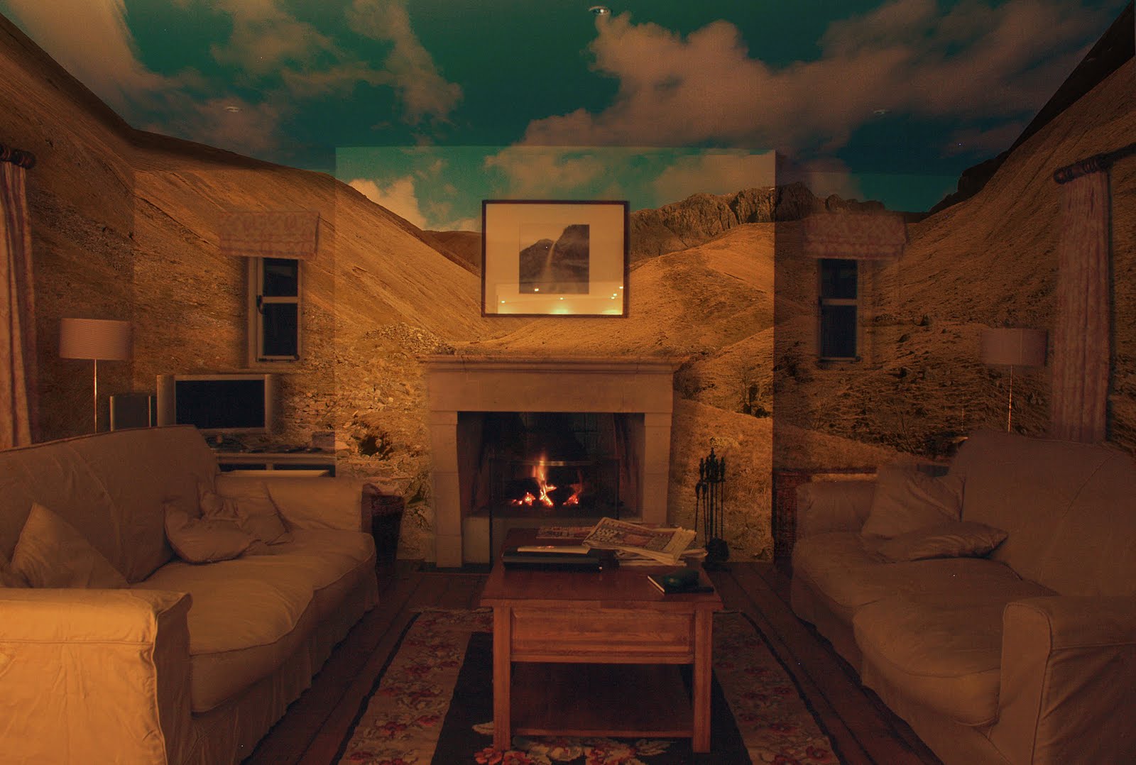
Moving on from project 28 here what I'm looking to produce isn't a seamless panorama but instead an image which gives the viewer something more to consider because of the multi angles and planes that you are placing together in a single image.
Its very much an abstract view that I'm aiming to produce by following a similar shooting process as with the previous project but on a much larger scale and by moving around the scene capturing it from a variety of different angles.


The image above was my first attempt at getting my head around working in this fashion, to begin with i just wanted to produce an image by taking a group of shots of a chosen scene and layering them together to produce a final view, i didn't what to add multi angles at this point i just wanted to focus on the actual scene and how to capture it. I was very happy with the end results at this point although i was surprised by how time consuming this process could easily become.


Moving onto the next stage of the process i select a much smaller area to work on but this time i wanted to add in the idea of multiple angles to begin to gain an idea of how to work in this area. Above are the results of this attempt, although I'm not overly happy with the end results i now had a much better idea of how i need to frame and move myself around the scene in order to complete this project to the level i wanted.


Above is my final image for this project and one that I'm fairly happy with, in all there's about 25 images involved in this one shot layered together in a way that still represents the original view but defiantly gives the view something more to think on. What i found worked best for me was not to go to mad and extreme on altering the view but by making small alterations to my position and focal length i found that i could get the view i was looking for. When working on this scale i did find that first time round i did capture all of the view because there's no way you can work to a pattern when shooting like I'd did with the last project, maybe its just me that finds i can't work this way but more then once when putting the frames together I'd discover i had a small whole that need a frame to plug it while other time i found that i could just slide another frame into the gap and the overall effect of the shot wasn't dented.

This and the last project i can most defiantly say have been some of my most favorite in this course because of how challenging I've found them but at the same time I've found the end results to be some of the most pleasing. In the future maybe even in my final assignment i can see that I'll be returning to this way of working.

Monday, 4 July 2011

Project 28: Digital Mosaic.

For the following projects I'm moving into the realms of more art then photography in some ways because you're asked in this project to study digital mosaic making and then in the following project which I'll come to later its a multi facetted view but again I'll explain more about this in dew course.

With Mosaic the example of work you're given to look at was produced by David Hockney (see http://www.hockneypictures.com/ ), what he did was use a Polaroid camera to capture small areas of his chosen subject and then take the results and put them together as a mosaic/collage. Some of his best work in this area i think is when he used the technique to photograph famous landmarks like the Brooklyn bridge because it gives a familiar view a completely different feel and look. Its a very clever way of producing an image because although there are areas of the image that have been duplicated because he's having to overlap shots to be sure he's capturing the whole scene the final images does look wrong in anyway because there is still the recognition of what the subject is.
The other way of approaching the subject would be to use photoshop to stitch the images together to create a final view of a subject, you would still capture the subject in the same manner overlapping the shots as you work but its just a different way of displaying the final results.

For my attempt at this kind of image i went for the Hockney approach and the subject i selected was some rose's. The first step was to create a blank file to work on in photoshop, then with a grid visible over the top of the blank canvas i started to open the images and lay them in order into the file. Th image below is the final results of this process.


What i found i liked about this way of working was how the final image looks, as I'd already said you do end up with a small amount of repetition but this does seem to have much of an effect on the overall image plus i liked the way that by having the light changing as i shot you end up with darker and lighter frames which equally add to the effect. One down side to working like this i found was its a little difficult to always keep track of what areas you've shot and which you haven't. What i found worked best was to shot it the way i intended to lay it out in the final images. This did help alot but you still have to be very focused on what you're doing to keep track of your progress. Overall i really enjoyed working this way because of way it tests you in being able to fore see how the end product will appear as you work, i defiantly can see myself using this process in the future.


Saturday, 2 July 2011

More On Assignment 4.

After getting my Tutor report back for it was time to take on board the comments made on what I'd produced and then re access my work to see what alterations i need to make. What changes i have made in most cases are only minor tweaks but they do affect the end results in different ways.


Clutter Original.


Reworked Version.

With my Clutter image my tutor had pick out that around the light switch and plug I'd had trouble making them appear naturally angler when picking them out of the background. His suggestion (and something I'd never thought of doing) was to highlight the area using one of the lasso tools or crop tools so that when i used the eraser it would clear anything outside the selected area. As you can see the results are much better and the whole piece benefits from this change.


House On The Hill Original.


Reworked Version.

Here it was the tones in the sky which my tutor felt could do with some work, he felt they need brightening but i found it quiet hard to find the right balance in this respect. What i did feel on studying this shot again was that i felt it was too dark so using the brightness/contrast controls i set about experimenting to see if i could get a better balance this way. The final version i think works better for this change because it gives the feel of much more space somehow because the shadows aren't so imposing as before.


On The Beach Original.


Reworked Version.

In my next image i could understand and fully agree with where my tutor was coming from when he said that it would be better to remove the insulation board because it filled the space where i could show more of my beach scene. Clear it also is quiet a dominate feature that was detracting from the rest of the image so removal was a must. The problem i did find doing this was that when using the clone stamp i hadn't got a lot of clear wall to copy into the space so it turned into a little bit of a time consuming process but again it clear has paid off in the end.


Open Spaces Original.


Reworked Version.

The final image that need some work had similar problems as House On The Hill, i went in the end with a similar solution to resolve the fault by lightening the whole image only very slightly but i feel better for doing this.

One thing i have learnt from this process and I'll be looking out for in the future is that some times my work can be a little to dark, whether this is down to my personal preference of subjects or maybe the way i have my monitor setup i don't know right now but I'll need to look into this as soon as poss.

Friday, 1 July 2011

Project 27: 360 Panorama.

The premise for this project was pretty straight forward find a location which could be used to produce a 360 degree panorama and then shot it. The way to do this is first chose your spot and then with your camera mounted on a tripod begin shooting the scene by taking one shot then slightly turn the camera to the right or left making sure each time there is a small amount of overlap between each frame so that the software I'll be using later can join the frames more easily, when I'd rotated the camera the full 360 degrees i have all the frames i need and I'm ready to begin stitching them together.

The location i chose for my image was on the very top of Scafell Pike in the Lake District, this kind of grand vista i thought would suit this way of processing down to the ground and the final image backs this up. To begin with i followed the process layered down in the course material which was to use the free trail program provided to build my image. I got the results i was looking for with this program but the only problem being i couldn't save the results because of it being a trial and i wasn't about to pay nearly £300 for some software i might never use again so i had to begin to look at alternative way of producing my panoramic image. First i tried using my version of photoshop because it has 3D layering tools in it and i thought I'd be able to use these to take the flat image I'd produced using Photomerge and then place it into a 3D layer, unfortunately my computer isn't powerful enough to complete this process so i had to look for another alternative. Luckily i found a site on the Internet called http://www.dermandar.com/ here you can upload you shots and the online software will build your panorama for you (you'll find my image here http://www.dermandar.com/p/bOvlsf/on-top-of-scafell-pike). A real good find this site and one that i found easy and straight forward to use compared to some of the software you can download to do the same job which can be a little time consuming and to be honest quiet confusing at times.

Some points that i discovered when doing this project was that its best to shot all the images on manual settings so that you get the same exposure throughout the scene. Also its best to over exposure the darker areas as you can always fix these later in photoshop. One of the main things i feel is that some parts of the course need updating a little, for example here the software provided for you to create your panorama is from around 2004 as well as the offer for money off if you purchase the full version of the program, this isn't the first part of the course that I've felt this about as some of the other areas are beginning to feel a little dated. Its not a major problem but one that you need to be aware of.

Sunday, 12 June 2011

Project 26: A Sequence In One Image.

For this project i had to produce something a little different in that in one single image i had to show a sequence of photos all blended together that portrayed movement in some way. To do this the best route was to get my camera mounted on my tripod and then keeping the camera in the same position shot the sequence i wanted. Being interested in wildlife photography i was on the look out for a suitable subject and one day i court site of a small rabbit that i thought might provide me with the perfect image. After positioning myself very quietly so as not to scare him off i settled in for a wait to see what kind of activity i might capture and was pleasantly surprised when he started to give himself a good clean. To begin with i did worry that the shutter noise might scare him off but luckily he seem completely happy for me to be there and never ran off till i was happy with what i captured and was packing up to leave.
When i came to combining the shots i found i had a small problem that i hadn't foreseen in that he hadn't move as much as I'd thought meaning that all the images just overlayed one another creating just a complete blur so i alter the way i combined the images to produce something a bit different because i was really happy with my shots and wanted to use them in some fashion. Below is what i finally produced.


In the course folder the first example they give you of this kind of imagery is of a bird of prey flying through the frame, although mine is similar in that its a series of images stitched together side by side it isn't exactly the same as you can see but it still show a series of images depicting movement in one single image. I did have a little trouble in blending the joins so that they aren't so obvious but in the end i think it turned out well. I know it isn't exactly what you're ask to produce but on the other hand i think it a good study of a wild animal and a different way of portraying animal behavior.

Photos I Didn't Use In Assignment 4.

What i present here is the collection of photos that i haven't chosen to use in my 4th Assignment for various reason which I'll explain as i go through them.


The problem i had with this first photo wasn't that the blend didn't work very well it was more the fact that there wasn't any real connection between the two images i used where as the majority of the work i sent to my tutor had some connection of one type or another. Its not bad but it just doesn't work right.


The next image i do quiet like but what made me leave it out of my final selection was because of the way the lines in the back wall make it feel as if the background is on a big slant compared to the door. I did try straightening the image in photoshop but found that when I'd straightened the background the door ended up instead at a very strange angle. A same in the end but its down to the fact that I'd did observe properly how the lines in the frame were running when i shot it.


This shot i again discounted firstly because of the lines in the tiles not appearing straight enough, i think this was more down to the wall then myself. Secondary, and the main problem was the way the colours didn't seem to work right together, because the tiles are such a bright colour i didn't think the darkness of the water and the shadows really help it to become a particularly appealing image. I did consider trying it as a black and white image but as it would have been the only one in the collection i discounted it straight away as it wouldn't have fit in at all.


The final image lost out because it didn't fit in with the overall theme, one it isn't an interior view that i placed a landscape into and secondly with only the small amount of colour in it it wouldn't have appear right with the rest of my work. I thought the symbolism of the shot works really well because the original is of the wall at the national memorial arboretum which has the names of all service people kill since the second world war on it and then with the poppies added over the top it just works.

Monday, 23 May 2011

Planning For Assignment 4.

For this assignment I'm asked to produce 8 landscape photographs which all address, in different ways, a common theme.(The suggested themes begin water, earth, fire, air) Clearly here I'm given alot of scope to be able as creative as i can be, my first thought was keep things simple and just shot a range of images following one of these theme and then use some of the methods I'd studied in the last section say to alter the light conditions or change the feel of the weather. The problem being that i can't say i feel overly inspired by this idea, but then the other day i read an article that gave me a much better idea.

Below are some examples of images produced by a photographer call Abelardo Morell (photos taken from his website http://www.abelardomorell.net/).


He produces these images in a mix of old fashion camera obscura technique and digital photography, what he does is first is turn a room completely dark by covering all the windows except for a small whole which the light from outside travels through and projects the image onto the opposite wall (it originally appears upside down but by using a prism he corrects this) then he captures the effect using a modern camera. Basically its alot like the way our own eyes capture images, what makes his work so interesting is the combination of the rooms and views that he finds and combines. Lets take the final example where the outside garden has be projected onto the wall, here its like you have to look twice to decide which parts are in the room and which are in the garden because the house plants blend so well into the theme. I also like the way the texture of the walls adds another dimension to an already clever concept.

What I'm thinking of doing for this assignment is something along the same idea but using photoshop to place landscapes onto the walls of room, i want it to feel like I've brought the outside into the room but i still want it to feel natural so maybe there should be some association between the two scenes. I'll have to think more on this but i thinks there's a good starting idea here.