Saturday 22 January 2011

Project 8: Altering Colour With Hue/Saturation.

The next process to look at is using the Hue/Saturation control to alter the colours, again i had to have a little search around to locate the control as in project 7 they weren't located in the same place as described in the course material (IMAGE>ADJUSTMENT>HUE/SATURATION). With hue/saturation you seem to have more control over the individual colour compared to levels where the changes you make have more of a effect over the whole range of colours.

What i found when experimenting with these controls was that by moving the hue slider i could completely change a selected colour to one completely different for example with the scene at the station below i had the trees appear as a very nice red colour giving it a very other worldly feel where as the saturation control basically controls how strong the colour appears, if the slider is moved to the left fully then for example the trees and the other green areas become grey while you move it all the way to the right the trees become a very bright green.


Original.


With 50% Saturation.
Above are a set of images that highlight how the hue/saturation controls can be used to make small adjustments to a selected colour in a similar way to levels but unlike levels it doesn't effect the colours around it. Here by selecting to alter greens and moving the saturation slider to the right 50% you can see that it makes the green of the trees and plants much stronger than they appeared in the original.


Original.

Altered Version.


As with project 7 the final stage of the project is to take this tool and use it to alter one of your own shots. I chose this photo of a hot air balloon because i took the original in the evening when the light had faded quiet a lot meaning that when i came to look at the shot on the computer i was a little disappointed because the yellow of the balloon seemed very dull compared to how it appeared at the time. Now i can fix this problem by using the saturation control in a similar way to the train station image to put the colour back into the photo and have the end result i originally wanted.


Project 7: Altering Colour With Levels.

In the next couple of projects the focus moves to how to use photoshop to change certain colours within the images i produce. Neither this project or project 8 are particularly taxing but they have given me a new set of tool that i understand better within photoshop and also made me study my own work a little closer because i hadn't relised how much of it has a slight colour cast produced by the natural light, but know i know how this can be removed.

The first way of altering colours that you're told to look at are Levels, in the course materials it tells you where this tool is located in photoshop but i soon found that with mine being a newer version they redesigned and moved its position. After a little hunting around i soon discover where it was hidden and was able to contniue (with my version of photoshop you had to go through IMAGE>ADJUSTMENTS>LEVELS ). What I'm asked to do is to adjust the levels so that the orange square on the second row of the oca colour chart becomes grey. First thing to do then is to take the RGB reading (which was R=231, G=150, B=71) then going into the levels adjustment menu set the channel to red, this meant that I'm only altering the amount of red in the shot (the way i like to think about it when doing this kind of process is it's like mixing a colour using paint). What I'm trying to achieve is to get the amount of red to be the same figure or as i found as close as possible to the amount of green present. Then when I'd done this it was time for the same process with the blue until i had all three levels at about the same figure thous producing the image below.


What's using levels give me is a very find control over the colour's in my images with the down side being as is clear above as you alter one colour it effects all the others around it.


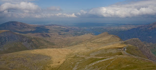
For the final part of this project it was time to put this process to use in one of my own shots, above is a photo i took while climbing Mount Snowdon last year it isn't a particularly bad shot but when you look closely you see it has a blue colour cast that give the over shot a little bit of a cold feel. This i could now fix using levels by making the red and green values the same and neutralising the colour cast in the process.


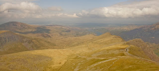
Above is the end result of this process and I'm a little in two minds about it. Yes the colour cast is gone and the shot has a much warmer feel to it but now to me it looks a little yellow and the colour of the hills doesn't seem as natural as i remember. Again this is the one draw back to the process in that it alters all the surrounding colours while removing the cast.
This as I've said wasn't an overly taxing project but I'm more then pleased with the end results as i show I've got a good understanding of the tool and its use within photography.


Wednesday 19 January 2011

Project 6: Measuring Colour.

In this project the focus is on how we measure colour in photography, I've already looked at how the camera captures colour and how this is measured both in the camera and on the computer screen and you may think that measuring colour is just the same principle but actually it isn't as i first assumed.

The camera measures colour by calculating the amount of red,green and blue that is present in an area but this isn't how the human eye evaluates colour, we understand it in 3 different ways which are-
  1. Hue- this is when we look at a colour and decide which of the primary colours is most dominate. It's measured in degrees as if the colour of the spectrum are arranged around a circle with red at the top 0 degrees.
  2. Saturation- this is how rich the colour appears and is measured as a percentage with 0 meaning no colour is present and 100 meaning completely saturated.
  3. Brightness- clear this is how bright the colour appears, it's measured like saturation as a percentage but in this case 0 equals black while 100 equals white.

This group of measurement is found in the info palette in photoshop under the title HSB usually nearby to the RGB reading, now that i know this the first thing to do is look at the measurements produced from my personal colour chart i made in project 5.


What you can see above are the RGB and HSB values of each individual square, what this shows is that i have the understanding to be able to take these readings from a simple chart but next you're asked to take this process a little further and collect readings from three of your own shots containing neutral colours, skin tones and finally vegetation.


Neutral Colours.
I took the reading in this first shot from the metal work of the bird.
  • R-126, G-133, B-149
  • H-222, S-15%, B-58%

Sky

  • R-116, G-139, B-180
  • H-218, S-36%, B-71%

Skin Tones.
Skin
  • R-126, G-80, B-57
  • H-20, S-55%, B-49%

Marque

  • R-179, G-163, B-129
  • H-41, S-28%, B-70%


Vegetation.
Corn
  • R-121, G-125, B-111
  • H-77, S-11%, B-49%

Bird

  • R-61, G-60, B-55
  • H-50, S-10%, B-24%


You're then asked to look at the neutral shot and consider whether the neutral colours are close to begin absolutely neutral which i don't feel they are. The reason for this is because it's a reflective surface it mirrors a little of the colour that surrounds it meaning a reading is never going to show it as completely neutral but our eyes tell us it is a neutral colour never the less. This fact is back up when you look at the RGB results because if it was neutral they'd be much higher and would all read the same but they quiet clear don't as a result of the landscape and the light.

When i compare the colours in the photos to my own colour chart and the OCA one on the course CD i see that the result tend to be closer to my own chart, this I'd expect because their taken to my personal preferences to colours. If some one else came along and shot the same scene at that moment they might set their camera completely different thus changing the way the colours would appear in the scene, like many parts of photograph colour as much as anything else is all a matter of chose by the photographer as to how it should appear this is why they are called Memory Colours.

I felt this project offered an interesting insight into how we consider colours without really thinking to much about what we are doing and i feel maybe a little more reading is needed for me to fully understand what I've just covered because i don't think this is some of my best project work to date.

Saturday 15 January 2011

Project 5: A Personal Range Of Colours.

For project 5 it's back to the colour chart again but this time what i had to do was fill a blank chart with a selection of colour from my own work. The idea behind this beginning that it helps you to analyse your own work and discover what colours appeal to you.

Above is the chart that i produced after studying my own work, what i tend to shoot at the moment is mainly landscape and wildlife images so what you see above is a collection of what i would describe best as natural colours. There's not really any bright colours as you'd expect because most landscape's be it urban or rural tend to be made up of similar colours such as greens, reds and greys and this is reflected in my chart as you have a good range of these colours plus a few blues and oranges.

Its not a very complicated project but what i did find was that it does give you an insight into your own likes and dislikes that you probably haven't considered before (i know i hadn't anyway). What i found was that i tend to like a strong solid colour in the foreground with maybe a small amount of a complimentary colour present just to break it up a little. When it comes to shots that include a large amount of sky i tend to like having very dark tones that make the sky feel very imposing and ominous giving the image a real presents. I know other tutors have told me that my landscape work doesn't always need such heavy skies so I'm in the process of trying a different approach.

Friday 14 January 2011

Project 4: Your Camera's Colour Performance.

This project continues the theme of understanding the limits of your equipment so as to gain the best results possible. Having found the Dynamic range of the camera we now move onto how it captures colour and how this can be processed further using basic tools in Photoshop.

Before we get to actually understanding what the camera is capable of capture we are told about certain limiting factors that will effect how the colours may appear in digital images, these being:-
  1. The way the computer monitor is set up because if it isn't set correctly it can produce false colour cast that means you'll over process the image and end up with a final shot that does mirror what you originally saw.
  2. Photoshop software can also produce a similar problem if it doesn't recognise how your camera has dealt with capturing the colour
  3. Finally if you print your image you may find it doesn't match the original, this can be down to a couple of factors either dew to the inks that you are using or the kind of paper that the image is printed on.

Luckily for me I'd previously resolved these problems by already checking that my computer and software were set up correctly and that when it comes to printing my work i tend to use a site like Photobox or Kodak that do the printing process for you thus making sure i end up with good quality prints.

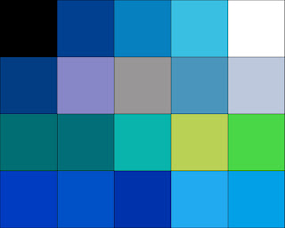
To understand how the camera I'm using captures colours what you're asked to look at is a Colour Chart supplied within the course material, what this is is a grid of naturally occurring colours that can help us to see how the camera is set up. First your asked to take a print out of the colour chart and and place it in the daylight somewhere there are no shadows present, then setting your camera to the appropriate white balance (clear daylight setting) fill the frame with the chart and take the picture. Below you'll see the results.

My Colour Chart.


Colour chart Aslooks.
Next you ask to open a file called aslooks and to compare it with the shot you've taken, the aslooks file begin a representation of the colours as produced in photoshop. The obvious thing straight of is that the aslooks colours are far stronger and much brighter then in my own colour chart for example if you look at the white square on the top row in the right hand corner in my shot it looks a little lighter than the grey square next to it and the yellow square in the third row is nearly orange in colour, the question is why. The simple answer is its down to the natural light which has a slightly blue cast to it that isn't visible to the naked eye as our brain and eyes interpret the light differently while the camera capture the light and colour produced more naturally. The effect this blue colour cast has can be seen when i take the RGB readings for each chart, in my chart the readings in the top row are as follows from left to right-
  • R-38, G-38 B-48
  • R-58, G-64, B-76
  • R-95, G-104, B-119
  • R-137, G-142, B-162
  • R-150, G-155, B-175

Compare this to the Aslooks chart-

  • R-17, G-17, B-17
  • R-52, G-52, B-52
  • R-97, G-97, B-97
  • R-161, G-161, B-161
  • R-243, G-243, B-243

What it shows is that in the darker colours it doesn't have a lot of effect but as the colours grow lighter the added blue makes them appear darker then they actually are.

To fix this i can use the Auto Colour Correction tool in photoshop which will remove the colour cast and put the colours back to there more normal tone, below you can see the result of using this process on my own colour chart. Straight away you can see that the colours appear much brighter and closer to the aslooks chart but i still don't think its spot on.

My Colour Chart- Colour Cast Removed.
In the course material it explains that these still visible differences are down to the way different makes of digital camera sensors capture the light. In my case my Canon EOS 400D seems to capture the colours slightly lighter then they actually are. The is obvious a good thing to know because it means that i can adjust the camera appropriately in conditions where i feel the colours need to be a little less bright knowing that the camera is over doing them a little. This conclusion is back up when you compare the RGB readings for the other three rows in the two charts.
My Colour Chart
Second Row (left to right)
  • R-104, G-77, B-70
  • R-231, G-175, B-178
  • R-214, G-139, B-83
  • R-198, G-159, B-138
  • R-233, G-205, B-193

Aslooks Chart

Second Row

  • R-77, G-49, B-45
  • R-204, G-103, B-109
  • R-211, G-117, B-56
  • R-173, G-117, B-92
  • R-223, G-173, B-150

There's no point including the rest of the result as they continue in the same trend showing that my chart is constantly brighter than the aslooks chart.

This project has open my eyes to a fact i wasn't really aware of although i have always used the photoshop software to make small alterations to my work i never considered why i was having to do this so often but now i see that i have to consider that the camera sensor can't always be trusted a 100% to capture colours as truly as i like.


Sunday 9 January 2011

Project 3: A Variety Of Lighting Conditions.

This next project is similar to no.2 (in that it relates to understanding Histograms) but this time its up to you to produce the photos and then explain how the histogram illustrate the different feature.
What it asks you to produce photos to the following criteria:-
  1. A full-scale image, with black, white and a full range of tones in between.
  2. A contrasty image, in which both shadows and highlights are right up against the edges of the scale.
  3. A flat, low contrast image, in which there are no blacks or whites.
  4. A high key image, meaning mostly at the bright end of the scale.
  5. A low key image, meaning mostly at the dark end of the scale.

It say that this is quite a challenging project and to be honest I'd have to agree because when i first read what it wanted you to do i just for some reason could get my head around the wording of the photos it wanted you to produce. After a second and third read i stop panicking a little and slowly came to realise it's only really asking you to produce your own shot with similar histograms to the images in project 2, once I'd understood this it was half the battle. For my photos i stuck to using black and white as it didn't specify whether you should shot in colour or not, but by using black and white it does make it easier to interpret the histograms.

Full Scale Image.


My full scale shot was taken during the last spell of wintry weather we had, what i like about this image is the feeling that you know something is missing with the empty feeder and no sign of any animals around. With the histogram the first peak on the left is produced by the feeder and its shadow then as you move right the next peak is formed by the heavy clouds and where it falls away is produced by the rest of the clouds and the trees in the background. The rest is made up of the snow covered field and the small peak near the far right is dew to the brighter part of the sky up in the left hand corner.


Contrasty Image.

This next shot was one i took local of a group of abandon vehicles that i walk past a couple of times and though that i could make an interesting photo from if i timed it right with the light. What i would have like the histogram to look like is a little more u shaped but i got it pretty much as close as i could. The peaks on the left hand side are the product of the strong shadows on the left hand side in the tree and in the bottom right corner where it is particular dark, next the smaller peaks on the left are produced by the grass in the foreground. The lower areas in the middle are formed by the lighter grey areas produced by the majority of the vehicles body work and the landscape in the background, then finally the high peak on the right is coursed by the sky and the cars bonnet.


Flat, Low Contrast Image.

This was a shot that i took back in the summer but the tones meant that it work perfectly as an example of a flat low contrast image as it lacked any strong shadows or highlights. The main peak at the centre is formed from the body of the image because it is pretty much solidly made up of grey tones. The small area on the left is made up by the people on the beach and the small are on the right is a product of the lighter areas within the clouds. I did find this one of the more difficult images to produce because of the way the light naturally is at this time of year (in that it seems to produce either strong shadows or very bright highlights) and when i tried to add light to a scene i just couldn't seem to get it right which is why i chose to use a scene shot earlier in the year.


High-Key Image.

My high key shot i captured in my back garden, what it shows is a winter visitor to these shore in the form of a Waxwing. I'd spent many weeks during the winter looking locally on Cannock Chase for this particular bird but had never manage to capture one and then what do you know a whole load of them land in my garden and start feeding (sods law). Because of the light is in this shot it makes it a prime example because their are no strong shadows and the tones remain pretty much gray other then in a few areas on the birds body which produce the low line in the darker section of the histogram. The bump in the middle is produced by the rest of the bird and the branches surrounding it and then the high peaks on the far right are formed from the tones in the sky.


Low-Key Image.


For my final low key image i used opposite lighting conditions to my high key shot to produce strong shadow but little highlights, what i like about this photo is the very lonely feel to it and shooting in black and white only adds to this fact. The peak on the left are formed by the shadows on the right side of the frame and the ones that are produced on the bears body and the shadow cast on to the wall. The small valley is made up from the material that it's seated on and then hill is produced by the gray tone of the wall, the only problem is the histogram shows that there are some very light tones somewhere in the frame but i just can't spot what it's picking up.
This project helps to build on what I've already learnt in project 2 but with it begin more of a practical exercise in that you have to capture the image your self as well as explain how the histograms relate to the photos, i feel that it has help me more to gain a fuller understanding of this small but important part of digital photography.

Project 2: Understanding The Histogram

For this project what you're asked to look at are the Histograms that are produced when you take a photo. Basically histograms are a way of visually showing you the dynamic range within the photo you just took and can be found in your camera by (a canon 400d) by pressing the disp. but when reviewing the shot. You can also look at the histogram within photoshop but i personally tend to only use it on my camera to check the exposure. This isn't the first time I've look at how histograms work and what they tell you as its been covered it not as much detail in other courses I've completed but i felt i needed to do a little more reading on the subject just to gain some more insight. What i found was the website listed in the right hand column called UNDERSTANDING HISTOGRAMS, this went over what i just covered in the dynamic range project and gave me some more info regarding histograms. It doesn't really tell you anything new but maybe explains things a little better in my view then within the course material.


For this project what you're asked to do is match a selection of black and white photos to there respective histograms, quiet easy i hear you say and that's what i thought but when it actually came down to doing it i got a few of them wrong but I'll explain why as i go through them.


Bluebells.


For this first picture i did manage to pick the right histogram because i recognised that because of the large amount of grey tones in the shot it would have to have a very large peak in the middle of the histogram. Add to this the small dark patches in the background and on the flowers and the same begin true of the white areas you'd end up with a very high peak in the middle and two relatively flat areas to either side, which is what you see above. What you do see on the right hand side is a very small peak which I'd say is probabley produced by the lighter area on the right hand side in the background. An easy one to begin with but they do get harder.


Carman.


Now here we come to the two shoots that i got confused the reason begin the small peak toward the middle of the Japanese girls histogram. Originally i thought that it belonged with the Carman shot because i took it to be indicating the man's lighter suit but actually what it is referring to is more lightly the sash around the Japanese girls clothing plus to her skin tone.


What you see with the correct histogram with the Carman shoot is that the high peak on the left relates to the majority of the dark background then the slightly lower peak is the man's suit and the lower area of the background. Next the very lower level across the middle is produced by their skin tones and then finally the high peak on the right is clearly produced by the woman's dress and the man's shirt.


Japanese Girl.


With the Japanese Girl photo again the large peak on the left is produced by the background as with the Carman image, then as I've said the smaller peak was produced from the sash and the skin tones. Next the small hill nearing the far right is coursed by her clothing and some of the lighter areas on the item she's holding and then finally the small narrow peak on the very right side of the histogram is the result of the light areas on the item in her hands and in the flowers in her hair.


Oil Flask.


The Oil Flask was possible the easiest to spot because of the it lacks any strong dark tonal areas so i knew that i was looking for a histogram more peaks on the right hand side and very flat on the left which is what you find above. With the histogram you see the low line through the darker range of tones produced by the dark areas outlining the flask and the first small peak is produced by the dark area around the neck of the flask, then the graph starts to climb coursed by the oil within and the surface the flask is standing on help to produce the first high peak. The final peak which is off the scale is produced by the blown out background which is so bright its beyond the range of the camera censer.


Pyramid


Next we come to the Pyramid which is similar to the Oil Flask but to the complete opposite end of the histogram. Here we see all the peaks mast in the darker range because of the lack of any brighter area (although saying that i would have thought you might have got a small peak produced by the light in the door way?) The high peak is produced by the building itself and then it falls away with the sand and the sky beginning a little lighter. The small peak on the far left is produced by the area of strong shadow on the face of the pyramid that is facing towards the camera.


White Magnolia.


Finally we come to what at first glance would appear the most complected Histogram because of the way there appear to be a good range of tones but only one really high peak in the middle (luckily i only had one left to chose from so i new which photo it had to belong to). This high peak relates to the background while the area on the left is produced by the leaves of the plant and the area on the right is produced by the flower.
Once I'd got the hang of this again it all became pretty easy to read, as I've said i did make a few mistakes along the way but this is all part of a good learning process. As i said at the beginning histogram are something that i already use to some extent to check my exposures because in previous course's it's been explained how they should look in a balanced exposure but its better to have more of a understanding of what a histogram is telling you about your shot and i now feel after this project i have this.

Saturday 8 January 2011

Project 1: Dynamic Range.

In this first project what we're asked to look at is the "effective practical" Dynamic Range of our camera, basically what this is asking us to find out is what are the darkest and lightest values that the camera can capture. To find this out you're asked to produce a set of shots and stitch them together to produce what you see below.


To produce these shots what i did was follow the instructions in the course material and take a sheet of white paper and place it in the daylight, next i got my camera mounted on my tripod and set the camera to its lowest ISO setting (100), next set the White Balance manually to daylight then finally set the camera to Manual mode and adjusted the shutter speed and aperture to produce and average exposure (these settings begin 0"8 at f/8 this being about the mid range aperture for the lens i used). Now knowing what the average settings where you asked to work out the settings that would produce a image 6 f-stops darker then keep increasing the f-stop by one until you reached the average settings once again (this gives you the dark range for the camera). Next you continue increasing the f-stops a further 6 images which then gives you the light range of your camera.


To form the above image i had to use Photoshop to stitch the shots together, to do this it involved resizing the canvas and then using the copy and paste method keep adding the images to the end of the chain. This was made easy to complete because its clearly explain in the course material so you have no problems understanding the process although i did find that because I'm using a slightly new version of Photoshop some of the stages where under different tabs or named a little differently but if you know you way around your software this isn't a problem.


Next i needed to take some readings from the image I'd produced so i could see what the Dynamic Range of my camera actually is. By passing the cursor over the image you are given the RGB value of each shoot. Below is the list of values-

  • -5 R=0 G=0 B=0
  • -4 R=22 G=22 B=22
  • -3 R=41 G=41=B=41
  • -2 R=62 G=62 B=62
  • -1 R=100 G=100 B=100
  • 0 R=130 G=130 B=130
  • 1 R=167 G=167 B=167
  • 2 R=226 G=226 B=226
  • 3 R=237 G=237 B=237
  • 4 R=251 G=251 B=251

To then find the Dynamic Range of the camera you have to move the cursor until the RGB values climb above 5, this was around the join between -5 and -4. This gives you the bottom end of the cameras range, to get the top end you do the same thing but look for the values to climb to around 250 or below which i found around the join between 3 and 4. This then in turn tells me that i have a camera that has a practical dynamic range (this is what when you print your images will be visible in the dark and light areas) of about 8 f-stops 4 either side of f/8.

For the final part of this project you are asked where the mid-grey step lies in your sequence, if its to close to the white it will mean that the light areas in your photos can appear burnt out (this means they will appear overly bright) or oppositely if to near to the dark end the shadows will appear overly dark. Luckily for me the mid grey sites as it should smack bang in the middle of the range at the 0 point meaning that I'll be able to have good control over the exposure avoiding the shot being to dark or to light.

For an opening project in the course i found this a very technical and challenging one to begin with, i understand that you need to understand the limitation of the camera before you can do anything else and now with digital camera technology its more important then ever to have the understanding to get the most out of your kit.

Start Of A New Course.

Having already completed the level 1 course Introduction to Digital Photography i feel i have a fair good understanding of how to use modern software to edit my own work, what this course say it aims to do is " is for you to become thoroughly proficient in taking images of the real world, and doing so with a level of mastery over the quality, colour, tone and the geometry that has never before been possible".
I find this an exciting proposition that i can gain a different perspective and see things a little differently by studying this course. As a photographer I'm always looking to be more creative with what i can produce while at the same time trying to find a stile of work that suits me and my main hope for this course is that it continues to help me with this aim.