Tuesday 13 September 2011

My Book.


Untitled | Make Your Own Book

After having my book printed contain all my Assignment work for this course i was a little disappointed in how some of the colours appeared so what i have here is the whole of my book as it should appear so you can see clearly how it should look.

Sunday 14 August 2011

Another Photo I'd Didn't Use In Assignment 5.


I nearly forgot to include this shot, this was Adding A Little Light from my notes on assignment 5 that my tutor recommended me not to include, i still like it but instead i add the image I've already talked about in my changes to assignment 5 section.

Friday 12 August 2011

Final Thoughts.

As i come to the end of another course i find myself asking what i have learned and what I'll take away from this. What i learned is simple Photoshop is a very powerful piece of software that is almost irreplaceable in the world of digital photography because of the creative powers it gives us. I seen alot of other peoples work over time and more often then not question how they produced that particular effect or how they'd made something look how they had but I'd never really before been able to gt my head around the processes involved or the time and effort that is needed to produce this work. From doing this course i now have the skill and confidence in using layers, blend modes, opacity control even using filter effects which before this point i had maybe played around with but never really understood the uses for them. On the whole i feel I've add a new side to my work that wasn't their before and found a new interest outside of wildlife and landscape photography, that's not saying i can't include what I've learn in this type of work its just now i can see other subjects as interesting because of the scope i have inside photoshop.
I was never a real fan of what i would call digital altered images but now i can see there merit and can understand why people are drawn to this way of working because more then once I've taken hours at a time just to get an image to look as i want it all because of the control that is available to me. I still think there are limits to how far you should alter photos but then maybe its down to the viewer to decide if I've gone to far, I'd like to think that i never have.

Tuesday 9 August 2011

Changes to My 5th Assignment.

After getting my Tutor Report back for Assignment 5 there was some alterations that my tutor thought could improve my work that I've had a go at.


One of the first thinks that i wanted to put in this section was the original image i used for my Me Or Is It? It'll probably help you to understand exactly what i did by being able to see the two shots together so that's what I've included above. I have to say that I'm still very happy with this shot not because I've radically altered my appearance but more because of the overall look of the final image.


One of the first alterations recommended to me to try was to make the cracks smaller in my Cracked image. To do this i used the clone stamp to remove alot of the bigger cracks but what i ended up do was removing a lot more of these plus some of the smaller one to see how it would appear with less cracks. It does i suppose look a lot less busy because of the reduction and you can maybe appreciate the shot its self more but I'm still leaning towards used my first attempt in my final selection because my gut tells me its the better one of the two.


The next image he thought could do with a slight change was Harvest Time, here it was more that he felt that the harvesters appeared to be all in a line moving over the same area (which doesn't appear really that realistic) so what he thought might improve it would be to move the rear most one over to the right a bit. This as you can see i did but whether its actually an improvement I'm not completely sold on, yes they do now appear more spread out across the field but to me the composition of the shot doesn't feel right. In retrospect it might have look better if I'd shot a number of frames over a much larger area of the field instead of in a straight line because then a more spread view would have been easier to produce.

Finally my tutor didn't rate very highly my Adding A Little More Light photo, here I'd basically just added a lens flare affect to make it appear as if the sun was really bright in a room so instead i produced a new image above. Here i duplicated the original layer and then converted it to black and white before using the eraser tool to bring through the colour of the boats below, its not one of the original images i chose to use but i think it still fits into the pattern of the other shots i have in this assignment.

Sunday 31 July 2011

Work i didn't use in Assignment 5.

What I've included here are the images that i didn't like or just didn't think work so didn't include them in my 5th assignment.


This first image is a different version of my Doorway image, what i tried to do here was create a mist effect to make it feel even more mysterious but i just didn't think i got the effect to look real enough so in the end i chose to use a version without mist which work and looked a hell of a lot better.


The image above and the one below where two i tried using a process of adding a pattern so as to make it appear that the photo was made up of a series of squares. To make up these squares i used other photos in the case of the above image from the surrounding area while with the portrait i used other shots of myself. I didn't use either because i just didn't feel the images really fit in with the rest of the photos I'd done. The effect isn't a bad one its just I'd didn't think it felt right for this particular assignment.


Above is another attempt i had at a Tilt Shift image, the one i used in my assignment looked alot better and really showed off the nature of the process much better. Again it isn't exactly a bad photo its just i did feel it look right maybe i used to much blurring and it would have worked better if the background and foreground had a little more focus.


The final image i chose not to use was one where i had attempt to introduce a sunrise/set into a landscape. The landscape i used was relatively dull light wise so i was interested to see whether i could add this kind of lighting and change the complete feel of the original. I used lens flare to create the sun effect and then a number of layering,blending and brush effects to try and get it to look and feel right. Alot of the process i took from a number of different tutorials off the Internet combining them to try and get the image i wanted but in the end although it did alter the reality of the image i didn't think it look that realistic and in the end gave up on the process.

Friday 15 July 2011

Planning For Assignment 5.


So here i am at the end of the course ready to take all I've learned so far and put into practice for my final assignment. What I'm asked to do is produce 12 images in the style i research in assignment 3 which was Altering Reality, this gives me a lot of scope for what i could produce because all the process given to you throughout the course can be used in one way or another to alter the realism of a photo. There are clear 2 kinds of photos that i can produce with this theme they are either ones that trick the person looking at it into believing that its real when it isn't and the second is one that clearly isn't real but yet believable in the way it appears.

I've already had a quick look on the student website just to get a idea of how other people have approach this subject and the results are quiet varied as you'd expect, one person RodTM took the approach of doing a whole series of images on the theme of unreal twins. A very clever set of image where the same person was posed in the same scene twice in different clothes and situations and then the two layer blended together seamlessly. Others had taken the approach of using all the skills they'd learn to create a group of images with no theme other than the idea of altering reality and i think this is defiantly the road i plan to go down because of the freedom of creativity this gives me within the idea.


Above is one of my first attempts where I've taking a photo and made it appear as if its almost a piece of street art because i first used an artist filter to give it the right look and then overlayed it over an image of a cracked worn surface to give it the right texture and feel. Overall very happy with this first attempt but i know i can still be far more creative yet.

Project 30: Strange Food.

For the final project in this course I'm returning to some similar ground that has already been covered earlier on but this time you're asked to look at the process from a slightly different point of view.
Where as before I've look at changing the colours of a scene or object to reflect a different feeling or season in the case of assignment 1 here its more of an extreme shift in the stile of Fauves and the German Expressionist painters.


File:<span class=


File:<span class=


The kind of work I'm referring to is shown above with two examples, the first by Henri Matisse and the second by Maurice de Vlaminck what they look to do was show strong colours and painting stile over the more realistic values that impressionist painters of the time were using. In other words they didn't want to create a true representation of what they saw but give a more distorted abstract view by using what they saw as extreme colours at the time. For example Matisse use very livid reds and pinks for the areas which normally would be painted in shades of green.


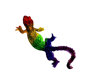
For the first part of the project your asked to use some work provided for you in the form of a lizard image and a file containing a multi coloured area, basically what i need to do was combine the two to create the above image so that instead of the lizard being brown and grey to match its environment you now have an extreme shift in colour so that it becomes rainbow in appearance. A simple step to begin with next to give a little more meaning to the idea of an extreme change in colour I'm asked to look at food. Here you can effect the view most when altering the colour of say vegetables because we all have in built into use what colour an everyday item should be to be appealing the example given in the course is a fresh cut of meat, we know it should be red but if it has a slight green ting we know that you should eat it. This maybe isn't the best example because what I'm then as to create is something with strange colours not rotten.


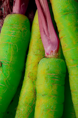
Above is the end result of my work, i chose a bunch of carrots as my subject then using the Hue/Saturation controls i was able to make the alterations you see above by taking the orange of the carrots and making them more green in colour, and then the green tops and turning them purple. Both are really extremes from the original colours but not so much that you instinctively imagine them as appearing rotten.

A final enjoyable project more dew to the fact of looking at a different artist group to understand there use of colour in there work then on the actual practical application of the theory. Another idea to take into my final assignment though which is never a bad thing.