Sunday 31 July 2011

Work i didn't use in Assignment 5.

What I've included here are the images that i didn't like or just didn't think work so didn't include them in my 5th assignment.


This first image is a different version of my Doorway image, what i tried to do here was create a mist effect to make it feel even more mysterious but i just didn't think i got the effect to look real enough so in the end i chose to use a version without mist which work and looked a hell of a lot better.


The image above and the one below where two i tried using a process of adding a pattern so as to make it appear that the photo was made up of a series of squares. To make up these squares i used other photos in the case of the above image from the surrounding area while with the portrait i used other shots of myself. I didn't use either because i just didn't feel the images really fit in with the rest of the photos I'd done. The effect isn't a bad one its just I'd didn't think it felt right for this particular assignment.


Above is another attempt i had at a Tilt Shift image, the one i used in my assignment looked alot better and really showed off the nature of the process much better. Again it isn't exactly a bad photo its just i did feel it look right maybe i used to much blurring and it would have worked better if the background and foreground had a little more focus.


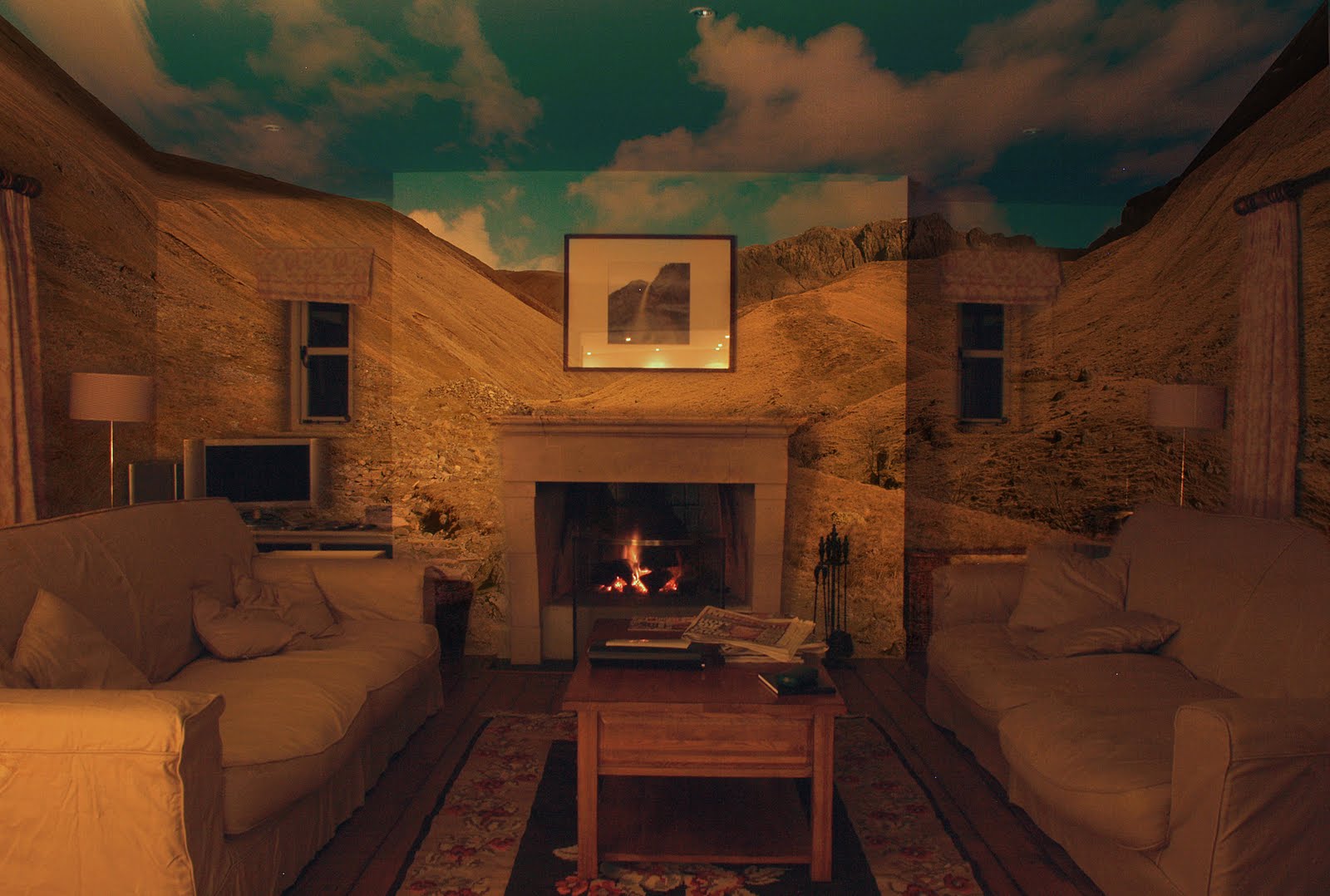
The final image i chose not to use was one where i had attempt to introduce a sunrise/set into a landscape. The landscape i used was relatively dull light wise so i was interested to see whether i could add this kind of lighting and change the complete feel of the original. I used lens flare to create the sun effect and then a number of layering,blending and brush effects to try and get it to look and feel right. Alot of the process i took from a number of different tutorials off the Internet combining them to try and get the image i wanted but in the end although it did alter the reality of the image i didn't think it look that realistic and in the end gave up on the process.

Friday 15 July 2011

Planning For Assignment 5.


So here i am at the end of the course ready to take all I've learned so far and put into practice for my final assignment. What I'm asked to do is produce 12 images in the style i research in assignment 3 which was Altering Reality, this gives me a lot of scope for what i could produce because all the process given to you throughout the course can be used in one way or another to alter the realism of a photo. There are clear 2 kinds of photos that i can produce with this theme they are either ones that trick the person looking at it into believing that its real when it isn't and the second is one that clearly isn't real but yet believable in the way it appears.

I've already had a quick look on the student website just to get a idea of how other people have approach this subject and the results are quiet varied as you'd expect, one person RodTM took the approach of doing a whole series of images on the theme of unreal twins. A very clever set of image where the same person was posed in the same scene twice in different clothes and situations and then the two layer blended together seamlessly. Others had taken the approach of using all the skills they'd learn to create a group of images with no theme other than the idea of altering reality and i think this is defiantly the road i plan to go down because of the freedom of creativity this gives me within the idea.


Above is one of my first attempts where I've taking a photo and made it appear as if its almost a piece of street art because i first used an artist filter to give it the right look and then overlayed it over an image of a cracked worn surface to give it the right texture and feel. Overall very happy with this first attempt but i know i can still be far more creative yet.

Project 30: Strange Food.

For the final project in this course I'm returning to some similar ground that has already been covered earlier on but this time you're asked to look at the process from a slightly different point of view.
Where as before I've look at changing the colours of a scene or object to reflect a different feeling or season in the case of assignment 1 here its more of an extreme shift in the stile of Fauves and the German Expressionist painters.


File:<span class=


File:<span class=


The kind of work I'm referring to is shown above with two examples, the first by Henri Matisse and the second by Maurice de Vlaminck what they look to do was show strong colours and painting stile over the more realistic values that impressionist painters of the time were using. In other words they didn't want to create a true representation of what they saw but give a more distorted abstract view by using what they saw as extreme colours at the time. For example Matisse use very livid reds and pinks for the areas which normally would be painted in shades of green.


For the first part of the project your asked to use some work provided for you in the form of a lizard image and a file containing a multi coloured area, basically what i need to do was combine the two to create the above image so that instead of the lizard being brown and grey to match its environment you now have an extreme shift in colour so that it becomes rainbow in appearance. A simple step to begin with next to give a little more meaning to the idea of an extreme change in colour I'm asked to look at food. Here you can effect the view most when altering the colour of say vegetables because we all have in built into use what colour an everyday item should be to be appealing the example given in the course is a fresh cut of meat, we know it should be red but if it has a slight green ting we know that you should eat it. This maybe isn't the best example because what I'm then as to create is something with strange colours not rotten.


Above is the end result of my work, i chose a bunch of carrots as my subject then using the Hue/Saturation controls i was able to make the alterations you see above by taking the orange of the carrots and making them more green in colour, and then the green tops and turning them purple. Both are really extremes from the original colours but not so much that you instinctively imagine them as appearing rotten.

A final enjoyable project more dew to the fact of looking at a different artist group to understand there use of colour in there work then on the actual practical application of the theory. Another idea to take into my final assignment though which is never a bad thing.

Monday 11 July 2011

Project 29: A Composite, Multi-Facetted View.

Moving on from project 28 here what I'm looking to produce isn't a seamless panorama but instead an image which gives the viewer something more to consider because of the multi angles and planes that you are placing together in a single image.
Its very much an abstract view that I'm aiming to produce by following a similar shooting process as with the previous project but on a much larger scale and by moving around the scene capturing it from a variety of different angles.


The image above was my first attempt at getting my head around working in this fashion, to begin with i just wanted to produce an image by taking a group of shots of a chosen scene and layering them together to produce a final view, i didn't what to add multi angles at this point i just wanted to focus on the actual scene and how to capture it. I was very happy with the end results at this point although i was surprised by how time consuming this process could easily become.


Moving onto the next stage of the process i select a much smaller area to work on but this time i wanted to add in the idea of multiple angles to begin to gain an idea of how to work in this area. Above are the results of this attempt, although I'm not overly happy with the end results i now had a much better idea of how i need to frame and move myself around the scene in order to complete this project to the level i wanted.


Above is my final image for this project and one that I'm fairly happy with, in all there's about 25 images involved in this one shot layered together in a way that still represents the original view but defiantly gives the view something more to think on. What i found worked best for me was not to go to mad and extreme on altering the view but by making small alterations to my position and focal length i found that i could get the view i was looking for. When working on this scale i did find that first time round i did capture all of the view because there's no way you can work to a pattern when shooting like I'd did with the last project, maybe its just me that finds i can't work this way but more then once when putting the frames together I'd discover i had a small whole that need a frame to plug it while other time i found that i could just slide another frame into the gap and the overall effect of the shot wasn't dented.

This and the last project i can most defiantly say have been some of my most favorite in this course because of how challenging I've found them but at the same time I've found the end results to be some of the most pleasing. In the future maybe even in my final assignment i can see that I'll be returning to this way of working.

Monday 4 July 2011

Project 28: Digital Mosaic.

For the following projects I'm moving into the realms of more art then photography in some ways because you're asked in this project to study digital mosaic making and then in the following project which I'll come to later its a multi facetted view but again I'll explain more about this in dew course.

With Mosaic the example of work you're given to look at was produced by David Hockney (see http://www.hockneypictures.com/ ), what he did was use a Polaroid camera to capture small areas of his chosen subject and then take the results and put them together as a mosaic/collage. Some of his best work in this area i think is when he used the technique to photograph famous landmarks like the Brooklyn bridge because it gives a familiar view a completely different feel and look. Its a very clever way of producing an image because although there are areas of the image that have been duplicated because he's having to overlap shots to be sure he's capturing the whole scene the final images does look wrong in anyway because there is still the recognition of what the subject is.
The other way of approaching the subject would be to use photoshop to stitch the images together to create a final view of a subject, you would still capture the subject in the same manner overlapping the shots as you work but its just a different way of displaying the final results.

For my attempt at this kind of image i went for the Hockney approach and the subject i selected was some rose's. The first step was to create a blank file to work on in photoshop, then with a grid visible over the top of the blank canvas i started to open the images and lay them in order into the file. Th image below is the final results of this process.


What i found i liked about this way of working was how the final image looks, as I'd already said you do end up with a small amount of repetition but this does seem to have much of an effect on the overall image plus i liked the way that by having the light changing as i shot you end up with darker and lighter frames which equally add to the effect. One down side to working like this i found was its a little difficult to always keep track of what areas you've shot and which you haven't. What i found worked best was to shot it the way i intended to lay it out in the final images. This did help alot but you still have to be very focused on what you're doing to keep track of your progress. Overall i really enjoyed working this way because of way it tests you in being able to fore see how the end product will appear as you work, i defiantly can see myself using this process in the future.


Saturday 2 July 2011

More On Assignment 4.

After getting my Tutor report back for it was time to take on board the comments made on what I'd produced and then re access my work to see what alterations i need to make. What changes i have made in most cases are only minor tweaks but they do affect the end results in different ways.


Clutter Original.


Reworked Version.

With my Clutter image my tutor had pick out that around the light switch and plug I'd had trouble making them appear naturally angler when picking them out of the background. His suggestion (and something I'd never thought of doing) was to highlight the area using one of the lasso tools or crop tools so that when i used the eraser it would clear anything outside the selected area. As you can see the results are much better and the whole piece benefits from this change.


House On The Hill Original.


Reworked Version.

Here it was the tones in the sky which my tutor felt could do with some work, he felt they need brightening but i found it quiet hard to find the right balance in this respect. What i did feel on studying this shot again was that i felt it was too dark so using the brightness/contrast controls i set about experimenting to see if i could get a better balance this way. The final version i think works better for this change because it gives the feel of much more space somehow because the shadows aren't so imposing as before.


On The Beach Original.


Reworked Version.

In my next image i could understand and fully agree with where my tutor was coming from when he said that it would be better to remove the insulation board because it filled the space where i could show more of my beach scene. Clear it also is quiet a dominate feature that was detracting from the rest of the image so removal was a must. The problem i did find doing this was that when using the clone stamp i hadn't got a lot of clear wall to copy into the space so it turned into a little bit of a time consuming process but again it clear has paid off in the end.


Open Spaces Original.


Reworked Version.

The final image that need some work had similar problems as House On The Hill, i went in the end with a similar solution to resolve the fault by lightening the whole image only very slightly but i feel better for doing this.

One thing i have learnt from this process and I'll be looking out for in the future is that some times my work can be a little to dark, whether this is down to my personal preference of subjects or maybe the way i have my monitor setup i don't know right now but I'll need to look into this as soon as poss.

Friday 1 July 2011

Project 27: 360 Panorama.

The premise for this project was pretty straight forward find a location which could be used to produce a 360 degree panorama and then shot it. The way to do this is first chose your spot and then with your camera mounted on a tripod begin shooting the scene by taking one shot then slightly turn the camera to the right or left making sure each time there is a small amount of overlap between each frame so that the software I'll be using later can join the frames more easily, when I'd rotated the camera the full 360 degrees i have all the frames i need and I'm ready to begin stitching them together.

The location i chose for my image was on the very top of Scafell Pike in the Lake District, this kind of grand vista i thought would suit this way of processing down to the ground and the final image backs this up. To begin with i followed the process layered down in the course material which was to use the free trail program provided to build my image. I got the results i was looking for with this program but the only problem being i couldn't save the results because of it being a trial and i wasn't about to pay nearly £300 for some software i might never use again so i had to begin to look at alternative way of producing my panoramic image. First i tried using my version of photoshop because it has 3D layering tools in it and i thought I'd be able to use these to take the flat image I'd produced using Photomerge and then place it into a 3D layer, unfortunately my computer isn't powerful enough to complete this process so i had to look for another alternative. Luckily i found a site on the Internet called http://www.dermandar.com/ here you can upload you shots and the online software will build your panorama for you (you'll find my image here http://www.dermandar.com/p/bOvlsf/on-top-of-scafell-pike). A real good find this site and one that i found easy and straight forward to use compared to some of the software you can download to do the same job which can be a little time consuming and to be honest quiet confusing at times.

Some points that i discovered when doing this project was that its best to shot all the images on manual settings so that you get the same exposure throughout the scene. Also its best to over exposure the darker areas as you can always fix these later in photoshop. One of the main things i feel is that some parts of the course need updating a little, for example here the software provided for you to create your panorama is from around 2004 as well as the offer for money off if you purchase the full version of the program, this isn't the first part of the course that I've felt this about as some of the other areas are beginning to feel a little dated. Its not a major problem but one that you need to be aware of.