Saturday, 30 April 2011

Planning For Assignment 3.

This is the point that i know i'm not alone in when i say god i hate writing essays! Don't get me wrong i enjoy the research and planning that goes into it but when it actually comes to writing the thing it's like my mind goes blank and i'm back at school struggling through a sea of english literature essays to do with books i have no interest in and would chose to read if they were the last book on earth, anyway enough of my complaining lets look at what you're being asked to consider in this assignment.
It asks you to select one of the following 4 topics-


  1. Opportunity and Enhancement.

  2. New Graphic Palettes.

  3. Altering Reality.

  4. The Margins of Photography.

Then find Photographers who are working in this area as well as images that illustrate it, then produce a review of about 2500 words about the work that is being done in your chosen theme.


So the first job is to pick which theme to study, basically the 4 themes given range from studying work with very little digital manipulation to work that is so altered that it's gone beyond the realms of just being a photos. The easy one to pick would be theme no.1 because photography is so easily accessable to people today that there are litrally thousands of peoples work you could look at so lets not pick that one. Personally i'm much more interested in the middle of the road kind of stuff where you're getting to the point of pushing the limits of what is kind of acseptable as a photo but your still using quiet a lot of digital manipulation to create your work, in fact thats not such a bad idea when it comes to using theme no.3. I could look at the ethics behind what they are doing and how they produce there work. Maybe this'll be easier than i first thought, but then again what photographers are out there that fall nicely into this catorgry?


Just when i find one solution to a problems i run head long into another finding photographer who's work i can study. To solve this i had a chat with some fellow students and photographs on flickr who were able through there own knowledge and research to point me in the right direction and also give me some good tips when it comes to doing this assignment such as focusing on small groups of photographers and trying not to get to bogged down in the techniques they use. Whether this is good advise or not only time will tell but now at least i have some names of photographers that i can start to look at.


Sunday, 17 April 2011

Another Look At Assignment 2.

When i wrote before about what i produced for my second assignment i did say that i wasn't overly happy with the end product and at some point would return to it to have a second attempt. What follows below is the image i produced this time and a few different versions of it where i experimented with effects and layering techniques. As with my first attempt this was produced using layers to place photos within the main image, a small amount of eraser tool was used around the light fitting so as the image on the ceiling only appeared to be there and not over the top of the light as well and i also used the clone stamp around the edges of the ceiling to extend the shot right to the point where the walls and ceiling meet. As with my original attempt i also used alot of overlay in the layers so that for example in the ghostly image on the bed you get the texture of the material below showing through giving it a more believable feel. With this image again I'm illustrating my day with the main image showing me leaving for work while the small frame shows me getting up, the large frame in the middle shows what i do for a living and the large frame on the right shows me realizing after work with a paper. I also added the image on the ceiling because i felt this gave it the kind of feel that what you're looking at is almost a dream with me looking down from above (maybe not to you but that's my view on it) plus this is almost reflected in the ghostly image actually on the bed. I know this is a little difficult to spot but its there. I'm alot happier with this shot i think because it isn't as straight forward as my first attempt its the kind of shot where you have to look at it a few times before you've taken it all in, i know it still isn't perfect by any means maybe you could say its a little too busy but I'd say its an improvement.


The above images I've basically had a little bit of a play around with just to see how i could effect the feel of the shot, the first is a straight forward black and white conversion this i think gives it a more moody feel but you loss the image on the bed as it blends that well with the background. The second image i produced using the photocopy filter to create an outline of the photo, can't really put my finger on why i liked this effect but i knew when i saw the results that it was one I'd have to keep. The only draw back to the photocopied image was its lack of colour so to fix this i layered underneath the original colour image and then setting the layer effect to luminosity played around with the opacity until i was happy with the results. The only downside to this effect is that they don't appear very realistic obviously and one of the aims of the assignment was to avoid creating something that was total unbelievable but i felt they need to be included so as to highlight that I'm more then willing to play around with the software to find interesting effects.

Friday, 8 April 2011

Project 20: Adding Shadows.

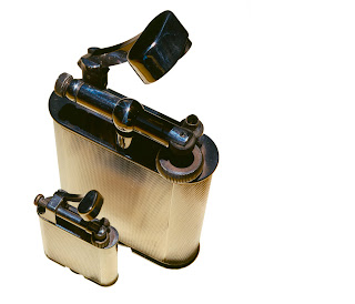
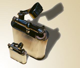
Now that I've got the hang of adding a simple shadow effect its time to move on to a slightly more difficult subject, in project 20 you're given the following image to work with. Using the same process that I'd already perfected with the clock faces i first added the shadow and then the gradient to give the impression of a light source. You can see the results of this below.

Next i had a go at also adding a shadow to the smaller object, i know in the course it tells you not to do this but i felt good about how my work in this section was progressing so i decided to have a crack and see how things turned out. Above are the results and again I'm fairly happy, the smaller shadow does appear a little too dark but other then this i didn't find it that hard a process to add this second shadow to the final image.


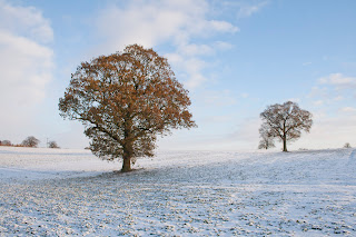
For the final final part of this project you're asked to shot an object yourself, separate it from its background and give it a shadow. Now i haven't really followed this project to the letter instead i wanted to see if i could add a shadow to a landscape shot of my own. The above colour image of the two trees is the original and as you can see the black and white one is my final version, to create this i first had to increase the image size so i could fit the shadows in where i wanted them, then it was just a matter of using the clone stamp to fill this new area and then again following the same process as before to add the shadows. The reason i produced my final image in black and white is because i feel it works much better to focus the viewer on the shape of the trees and the shadows they appear to be casting.


Although i still feel that i need more practise to refine the process of adding shadows i think by finishing this project in the way that i have it shows that i understand it well enough to use it in any number of future situations.

Monday, 4 April 2011

Clocks.

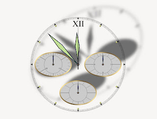
Creating shadows has been something that i've always avoided because of how difficult i imaged it would be to create an effect that you could look at and honestly believe was real, so to find that now i have no choice but to have a go you can guess the kind of mind set that i approach this with. Before i get to project 20 which looks at creating more complicated shadows there is a small section to get through first in regards to giving a clock face a shadow. The basic process for creating a shadow is as follows-

  1. Create a duplicate layer of the object you wish to add a shadow to

  2. Take this dupicate layer and in this case highlight the clock face and using the fill tool fill it with black.

  3. With the duplicate layer still selected make sure it is under the original layer and select Edit>Transform>Distort and drag the top corners slightly to the right or left depending on which way you want the light to appear it is coming from.

  4. Next use Filter>Blur>Gaussian Blur on the duplicate layer and set it to about 11 pixels this give the effect of diffusing the layer and making it appear as if its further away from the original then it actually is thus creating depth.

  5. Finally to make the shadow seem a little less strong reduce the opacity of the layer by around 50% and then flatten the two layers together.


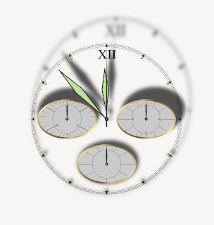
If you follow the above process you end up with an image which looks a little like the one above, i have to say this was a lot easier then i ever imagined it would be for some reason i thought it would take days to create something as realistic as this and then i never would have guessed it would look anything like this. Even at this point when I'm nearly half way through the course I'm still surprised by what you can actually do with layer and modern photo software if you know what you're doing, I'm beginning to think that with the right tools anything is possible in modern photograph.


Just to finish off this section i had a little more of a play around to make sure i fully understood the process. In the two above images i used different amounts of distortion and blur to increase the feeling of depth/distance just to see what the limits of the process actually are. With the second image i feel that i maybe went a little to far because the distortion appears too strong and at a bit of a strange angle that you would imagine possible but with the first one I'm quiet happy with how it seems that the light is being held very close at a low angle stretching the shadow but keeping very dark.