Thursday, 31 March 2011

Project 19: Focus Blur.

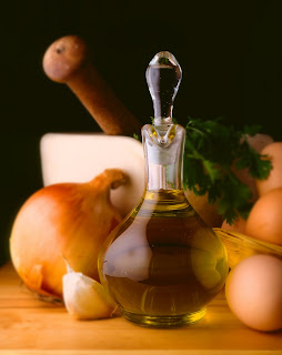
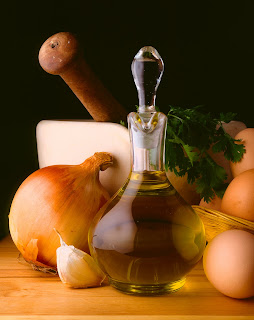
Following on from producing fake skies i next moved on to looking at how to create Focus Blur using photoshop. Within the camera this effect is usually produced by altering the F-stop which in turn will also effect the speed of the shot so if you don't have your tripod to hand you can find yourself limited in the amount of focus blur you can produce, luckily there is another alternative where as you take the shot and add the blur later in editing so this is what you're asked to look at in the following project. To begin with you're given the above image and told to duplicate it in layers so that you end up with 2 versions of the same image. Next you take the bottom layer and apply to it a Gaussian Blur which is found under filter>blur>gaussian blur, this is a simple filter which effects the radius of the blur and you're told to set it to around 5 pixels. Then moving back to the top layer and selecting the eraser tool i began to rub out the areas that i wanted the blur below to show through, in this case i wanted all the area behind the olive oil container to appear out of focus. Below are the results of this process and I'd have to say that it does appear just as i would imagine it would have if taken straight from the camera set to around f/5 or there abouts because the effect works that well.
To take this process a step further I'm next asked to take the image and give it the feel of a more gradual blur, what i mean is that instead of the whole of the background begin blur at the same setting this time i blurred it in stages using two duplicate layers and the original. The image below was achieved by first taking the bottom layer and again using the gaussian blur filter but this time setting it to 10 pixels, next i selected the middle layer and this time set the filter to 5 pixels. Now i had to take the eraser tool and remove the areas which i wanted the more blurred layer below to show through, so in this case i went for the mortar and pestle and greenery. Finally working on the very top layer i used the eraser once more to remove everything but the olive oil container so that i ended up with a shot that had the feel i was looking for. If i had to chose which one of the two images I've produced i prefer I'd go for the second more gradual blurred image mainly because by using the Gaussian blur filter in this way the image feels as if it has far more depth to it then it actually has.


To put this effect into use in one of my own photos i went for this image of a heron, the reason i chose this particular shot was because of the fact i hadn't had chance to get set up with my tripod so i ended up with all the background being in focus as well as the heron and this I'm afraid rather spoiled it in my eyes (see above). Here then i have a chance to rectify this problem so using the same process as before i create two duplicate layer and then used the Gaussian filter produced the tow layer of blurring. Below is the final version and what you can see is the more heavily blurred area is in the tree roots and on the bank, then slightly less blurred is the actual river around the in focus heron. This is much closer to what i originally intended but i still think that i could have blurred the bank and tree roots a little more not completely out of focus but just enough to give it even more feeling of depth. I like this effect alot and can see that it'll be very useful in the future as a fall back option if i don't get things right for one reason or another.


Monday, 28 March 2011

Project 18: Gradient Filter.

For the next project I'm back to a subject that is far more interesting to me in using Gradient Filters to produce realistic skies. One problem that i do run into now and again while working with landscape photography is how to get the sky to look right when shooting more into the light, what you tend to end up with is a over exposed sky because your camera takes its settings from the foreground not the sky. One way around this is to take two images one exposed for the sky and the other for the landscape and then combine the two in photoshop, this does work well but can sometime be difficult when combining the two layers to make it appear natural. This project takes a similar route but here i learnt to use the Gradient Tool to create a realistic sky. Above is the first image you're given to work on, it has all the problems that I've already spoke about so now I'm going to follow a simple process to produce a new sky for it. First i had to create a new file which is going to make up the new sky, this i made twice as wide and three times as tall because it will make it much easier to position the above photo in later. The new file i then filled with a blue colour using the fill tool and then next selected the Gradient Tool and a slightly lighter blue colour from the colour palette, then with the gradient tool set to radial i dragged out from the centre of the image creating a lighter area in the middle of the image which then gets progressively darker as it moves outwards. The next step is to squash the image using image size to around a third because this gives it a more natural sky appearance and then i moved on to pasting the original image onto my new sky. Using the magic wand tool I'd already selected the buildings so it was just a matter of pasting them onto the new sky and then positioning it where i felt the effect worked best, once this was done and i was happy the final steps were to first use a little Gaussian Blur on the background to make it blend better with the buildings and then flatten the image and crop away the excess background because remember I'd made this much larger then the original image. Below are the results of this work and i have to say I'm pleasantly surprised with how it turned out, i was a little sceptical in the beginning about how natural a false sky would appear but to tell the truth it does stand up to scrutiny really well. The only draw back i can find with it is that it does lack any cloud detail, i know that not all sky have to have clouds in it but i just feel it would look that little bit more realistic with these included (maybe its because of where i live and a blue sky is something of a rarity at the moment.)


As always the final part of the project is to put the method of the project into action in your own work, for this project i chose this very rugged shot that once again has been slightly spoiled by the blown out sky but now this doesn't have to be the end of the world because i have a new way to fix it. Below are the end results and once again I'm really surprised about how well it works maybe i shouldn't be by this point but for some reason i never expect it to work as well as it does. Personally i think it makes a great improvement to the original because of the way the blue contrasts with the green colours in the rocks and mountains.


Although I'm not a big fan of making large changes to my work like this i can now see how using tools like the Gradient Filter can have beneficial effects to my work, don't get me wrong I'm not one of these people who believe that you photos still should appear just as they were taken in the camera in modern digital photography you have to be open to making these kind of alterations if you want your work to standout. I just feel a little uncomfortable doing it sometimes but then that one of the reasons i chose this course in the first place because the more i understand about the uses of photoshop software in photography the happy i am using it.

Friday, 25 March 2011

Reflecting On Assignment 2.

I've now had my Tutor report back on my second assignment and he seems relatively pleased with what I've produced, the only point he highlighted was with my Paper image which he felt would have looked better if I'd lighten the shadows. I can see his point but i thought the strong shadows created by the side light gave what ordinarily would be a quiet normal straight forward shot more of a moody aspect. Below is the shot in question how i sent it to my tutor, judge for yourself if you feel it needs adjusting but i still like it how it is. During alot of the other course's I've done this seems to be an area where I'm regularly told that my work would look better if the shadows weren't so strong but i like this way of shooting and don't honestly see the problem. I supposes it's just one of the areas in photography where you can say it more a personal taste you either think it works or you don't.

Looking back now on the assignment as a whole I'd say it wasn't my best work mainly because it isn't a subject matter that I've ever found that appealing. I never that drawn to taking shots of people so it wasn't something that i had alot of experience in so in this way it was a useful learning tool but more than anything it just reinforced the idea that it isn't an area of photography that I'm that comfortable with or fine that i create very original photos when working in.

When looking at what i actually produced i do now wonder whether i could have found a more interesting background for my main body of work to sit in. What i mean is maybe i could have found something that actually related more to my daily life say somewhere i pass by everyday that i could then have placed my images into and would have had more of a meaning on the work as a whole (i know I'm rambling a little but i hope this makes sense).

Monday, 21 March 2011

Tilt Shift

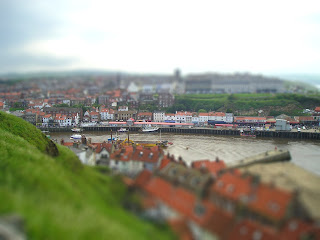
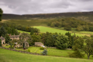
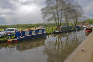
I've recently discovered an interesting processing option called Tilt Shift, basically what it does is let you select an area in your photo that you wish to keep in focus and then the rest of the shot is heavily blurred. What you end up with is an image that makes objects and building appear like miniatures dew to the depth of field that it produces.

Below are some examples of the sort of thing that can be produced.


What i found while experimenting with this process is that it helps if the shot you pick to work on already has a good feeling of depth to it because then the process really exaggerates this effect. The shot that i think works best in this respect has to be the harbour shot because it has the most depth originally. I like the effect it produces and can imagine so far better shots i might be able to produce with it in the future.

Project 17: Retouching A Face.

After learning to use the Clone Stamp tool to extend a photo in the previous project here i moved on to looking at another use, in this project its more how it can be used to make small adjustments when working with peoples faces and appearances.
Retouched Eye. Normal Eye.
Normally this isn't an area of photography that i find that interesting so i tend not to do much work where I'd need to do any retouching on a persons face but for the purpose of this course I'm happy to have a go and see what i could achieve. First off you asked to look at the image of the women's eyes, here you're asked to go through the process of removing lines from below the left hand eye by first selecting the area with a highlighting tool then softening the selected area using a very light amount of blurring so as to maintain the colouring of the skin but to remove the texture then finally using the clone stamp and selecting an area around the cheek bone add texture back to the area you've blurred. Now i followed this process to begin with and found that the end results weren't that great, what i mean is that i could really see when compared to the other eye that I'd altered the area under the left eye so i tried to alter the process to gain results i was more happy with. Above is what i finally settled on as being my best effort, to create this image in the end i simple went down the route of just using the clone stamp with a very soft brush and the opacity set to around 60%. By doing this i feel that the texture and skin colouring seem much more natural then any of my other attempts. On reflection i feel the shadows under the retouch eye are still a little strong but this could be easily rectified by increasing the opacity slightly just to hide this area better.


Original Cheek.


The next step was to take the image of the women's cheek above and remove the two small moles on the upper area of her cheek. To me this was a far easier process and one that i felt i did a real good job on with my first attempt.


Retouched Cheek.


To produce the image above it was just a matter of using the clone stamp to remove the moles and there associated shadows. Again you had to be very much aware of the skin tones in choosing an area to clone from (i went for an area just above but not to far away from the affected area because of it being quiet a light area but with a small amount of shadow created by the hair line). As I've already said i felt pretty pleased with my efforts straight away this time whether this is because I'm becoming more proficient with the clone stamp or whether its just my ego talking i leave you to decided.


Original Face. Retouched Face.
For the final part of this project you're asked to take a shot of a face for yourself and then apply what you've learned to retouch it. For this process i used my own face as there are some small place that i knew i could alter and one more major area that i could attempt to alter. The smaller areas were quiet straight forward these being the larger freckles on both cheeks and the small scare that runs along the bridge of my nose. The more complicated alteration i wanted to make involved my left eye which sits slightly lower than the right, here i wanted to attempt as best as i could to level it with the right one. To do this i used the lasso tool to ring the eye then simply copy and pasted the area into a new layer and repositioned the eye as best i could. Then after merging the layers i used the clone stamp to blend the edges into the skin around it so as it wasn't obvious what i done. I'm fairly happy with the end results as i haven't gone for any major changes because as it say in the course i did want the face to appear doll like in appearance as after all I'm looking for things still to appear natural. One thing i did consider afterwards was whether it would have been easier to have drop the right eye instead of raising the left but i not that sure it would have been that much easier.
I did really enjoy this project as much buts that's more to do with the subject matter then the actual process that I've studied I'm more of a landscape man and I'm not that interested in portrait work but i suppose it doesn't hurt in the long run to attempt all forms of photography so maybe one day I'll have more of a go at this kind of work.


Friday, 18 March 2011

Project 16: Extending An Image.

In this next section of the course we start looking at using at how to use individual tools in Photoshop to edit and alter photos, in this project its the Clone Stamp. The Clone Stamp is one of my favorite tools and something that i learned to use very early on because of how useful it can be in removing imperfections within your shots that you might have noticed when taking it. For example to begin with i used it most to remove small specks of dust or dirt that had got onto my lens while the cap was off and i hadn't noticed until it came to reviewing my work in photoshop. This is a relatively easy fix with the clone stamp because it only means you have to alter a very small area by first selecting the stamp tool then highlighting the area you wish to copy from by pressing the Alt button and then right clicking on the mouse, then by using a soft edge brush you can paint over in affect the troublesome blemish and have the perfect shot once more. Of course you can use the clone stamp on a much grander scale and in this project that what I'm asked to look at.
Original Thaihouse.

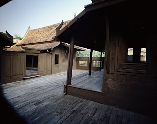
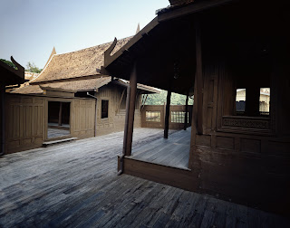
Above is the image I'm given to work with on the idea of with a clone stamp you can extend the image into the areas in the top left and bottom left corners where no detail is present. Below are the results of my work, first i fixed the sky which was a pretty straight forward problem as there are no clouds to bother about and the sky is pretty much one uniformed colour which meant i could pick any spot to clone from. The floor on the other hand was much more of a challenge because you have to be aware of the direction each board is heading in and the lines that are produced by each section. This meant that more time was needed to make sure that each board was cloned individual and that there was good continuity throughout the cloned area. I had attempted to clone large areas before but this was probably the most complicated area I'd ever tried to copy before so I'm very happy with how the final shot turned out and i feel the effort i put in really shows.


My Extended Thaihouse.


Original Whitby Abbey.


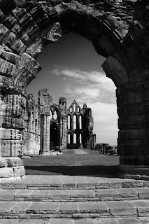
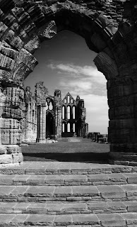
For the final part of the project its back to your own work and following the same process on a shot of your own, the photo i went for was a shot i took of Whitby Abbey in Yorkshire. First your asked to expanded the canvas size by 10% down one side of the image so i did this to the bottom edge because i new this had the most potential for expanding. To begin with i just copied the steps that i already had straight in to the extended area but i soon noticed that it was very obvious that I'd done this so i new i had to break up the pattern produced by the stone work so that it look different and more natural. By selecting individual steps and moving them around i was able to produce the illusion (because after all that's what it really is) that it wasn't just the same area copied but a real life continuation of the steps. Again i think the results below area really good and show that i have a good understanding of how to get the best out of the clone stamp tool.


Extended Whitby Abbey.


Sunday, 6 March 2011

Planning For Assignment 2.

The first thing i wanted to do in planning for my day in the life image was to have a little more of a play around with layers and some of the effects that can be produced. In my tutors notes on my first assignment he had included a very useful link to a site which takes you through the process of creating some different effects, the ones i chose to have ago at were creating a grunge effect frame and the king of the jungle image.


With the grunge effect frame above it was a matter of creating a blank file and then using layers and brush work to get the final effect how you wanted it. I will not go into detail but if you want to see the process in full follow the link on this page that says 25 photoshop effects. I like the effect but I'm not certain the photo suits it that well as it makes the image feel a little constrained.


The other process i attempted was the king of the jungle image, here you had to collect together all the different pieces such as the painting of Napoleon, the lions head and the skull in my version above and then using layers and blending effects combine them into the final version above. I did find that some of the pieces weren't available anymore and unfortunately some of the stages in the walk though i couldn't complete because I'm using a different software package to what they used but overall i think i manage to produce a very convincing image, this i found a lot of fun to do even though on first reading the walk through i felt it was going to be a really pain in the backside to do.


To get some idea at how other people have approached this assignment i had a look online and discovered a few examples. First i looked at Eileen Raffertys blog Photosynthesis http://www.flickr.com/photos/eileen_r/5482703586/in/set-72157625937913800/ ,here she gone for very small self portraits picking out individual characteristics of herself during a day. An interesting approach but a little lost on me on how this showed she'd used any of the methods learnt in the course up to this point.


Next i found on flickr an image much more in keeping with what I'm thinking about attempting http://www.flickr.com/photos/chaoticbeaut/4476623251/, here the person had used a combination of images of things they do during a day and thinks that have a meaning in there everyday life to produce a single image. I like the way they used the windows to show a completely different scene but the blending is really good and you can hardly tell its been add other then the fact it isn't a scene you'd ever see out of a window. I also looked at her inspiration which was Jeff Walls A View from a Apartment, i like the idea of taking shots from a single camera position and them combining them into one believable photo.


The final image i look at went for a very minimalist approach in that it only used three images to illustrate the idea of a day in the life http://www.flickr.com/photos/b2photo/3898279396/, with this one i loved the way the shots had been blended together on the background even down to the reflections in the lower half of the frame but i did feel that maybe it could have done with a few more shots to illustrate the theme.


I got so interesting idea now to start building my own image and I'm looking forward to seeing what i produce, to be honest i feel that a collection maybe 5-10 images would work best for me so what I'm planning to do is chose a subject and then follow that person through out the day so i can capture the parts of the day which best show what this person is like. I've already found a good background which I'm planning to use its a door with some posts stuck to it, all i got to do is work out a way to get the texture of the paper to come through in my photographs maybe using layers and some of the blending options that I've looked at in previous projects but that will be probably a little bit of trial and error.

Thursday, 3 March 2011

Project 15: Adding A New Sky.

Original Image.


Clouds.


Combined Image.


In the final project in this section its kind of a repeat of project 14 but with a twist, this time you're asked to add a new sky to one of your own landscape shots. For the first part i had the perfect shot taken during the winter (see original image) it has a nice cold, empty almost lonely feel to it but the one thing that i felt let it down was the blue block created by the cloudless sky, what i would have like was a heavier even stormy sky to add a little drama to the pieces. At this point i must warn that my tutors in the past have mention that my landscape work can appear a little bit to over dramatic alot of the time because i do like a good stormy sky.
Next it was just the matter of getting a shot of a good sky that i felt could improve the image, my Clouds shot above was taken over Blitfield Reservoir just as the clouds were building to let lose one hell of a down pore. I chose to shot in this area because i wanted a large open space to work in that felt like it had a very big sky and i think i achieved this really well.
Now came the job of combining the two images, first i opened my cloud image which i then copied and pasted the original image over the top off (I'd already made sure they were both the same size so they 'd sit over one another nicely). Then using a reasonably size soft rubber i erased the sky in the original to reveal the new cloudy sky below taking great care along the horizon because if i wasn't careful this was the one place where you'd be able to tell that some alteration had taken place. Finally i flatten the two layers together and i was finished.
The combined image above shows the results of this process and again as with the previous project I'm very happy with the end results, the scale seems fine and as i said the only place where you might have been able to spot the merging of the two shots shows no signs of this.
Now its just a matter of putting all this work from this section to use in my next assignment.


Tuesday, 1 March 2011

Project 14: Adding An Object.

Flower.

Project 14 is a simple follow on from the previous project, now that I've learned how to select and highlight part of a image which in my case was the flower you see above its time to learn how to place this into a completely new image and make it appear as realistic as possible.


Original Photo.


The shot I've chosen for my new background was one i took last summer at the Magpie Mine in Derbyshire. The reason i went for this image was the simple fact that i thought i could produce something that would look very natural by just exchanging one flower for another. I know it isn't overly complicated or particular original but i wanted to keep it relatively simple for my first attempt.


With Flower Added.


Above you can see my final image and if i say myself i think its not bad at all. To begin with the first problem i had to resolve was the fact that the colours in the plant were far to strong which meant it didn't sit naturally within its new surroundings. This was quiet easily resolved by altering the hue/saturation settings so it appears more in sink with its surroundings. Next using the free transformation controls i re sized the flower so it was more to the size of its new background and it had to be aligned so that the original plant stork and the new flower stork fit together right. Finally it just need some work done with the clone stamp to remove the rest of the old flower from the background and also i wanted to add some of the little hairs that grow up the stork onto the new part connected to the flower, then i merged the two layers together and there you have the final image. While i was using the lone stamp i forgot to mention i also remove some of the grass from around the building because it made the shot feel a little untidy i felt.
I really enjoyed this project because its one of them ones where you put the time and effort in and the results speak for them self. There's something about creating something you know isn't real as in that's not how the scene originally appear but if done properly no one else should know.